Overview
In this post, we will explore a basic workflow of analytics. This will serve as a high-level overview, through each application of API Connect's Analytics page. First, we will create a saved search. Next, we will create a visualization based on that search. Finally, we will create a dashboard that incorporates that visualization. We will go through an example of a jewelry store with two APIs: one for watches and one for bracelets. I will be referencing saving particular names based on this scenario, so replace the names with something appropriate to your use-case if it differs. In the following posts, we will dive deeper and explore some of the key components of each application. In doing so, we will continue building out a dashboard that will compare two API's.
Discover
The Discover application is where you can interactively search your data. You have access to all of the analytics documents in their raw form. You can specify what data you see using search queries and filters. You can also view the document's contents and link to an individual or surrounding documents.
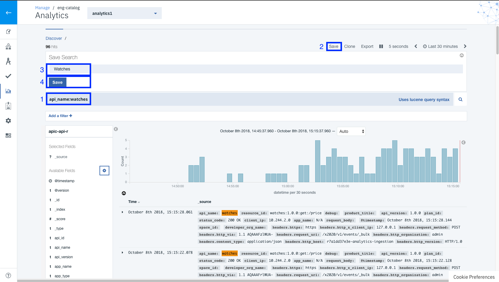
Let us start by creating a new search. Open the
Discover tab, by clicking the
Discover tab at the top of the analytics page. To create a new search click the
+ button just above the table. This will bring us to the Discover view. Here we can enter a search query of
api_name:watches in the search field box ensuring we have the time filter set to accommodate the data. Finally, click the Save button in the top toolbar. Name the search
Watches and click Save. Now navigate back to the Discover landing page by clicking the
Discover tab at the top of the analytics page. You will notice the search we just created is listed in the table.
Visualization
The Visualize application is where you can manage how your data is visualized. The created visualizations can later be compiled into dashboards for displaying related information. You can base your visualizations off of saved searches from the Discover application or create new search queries.
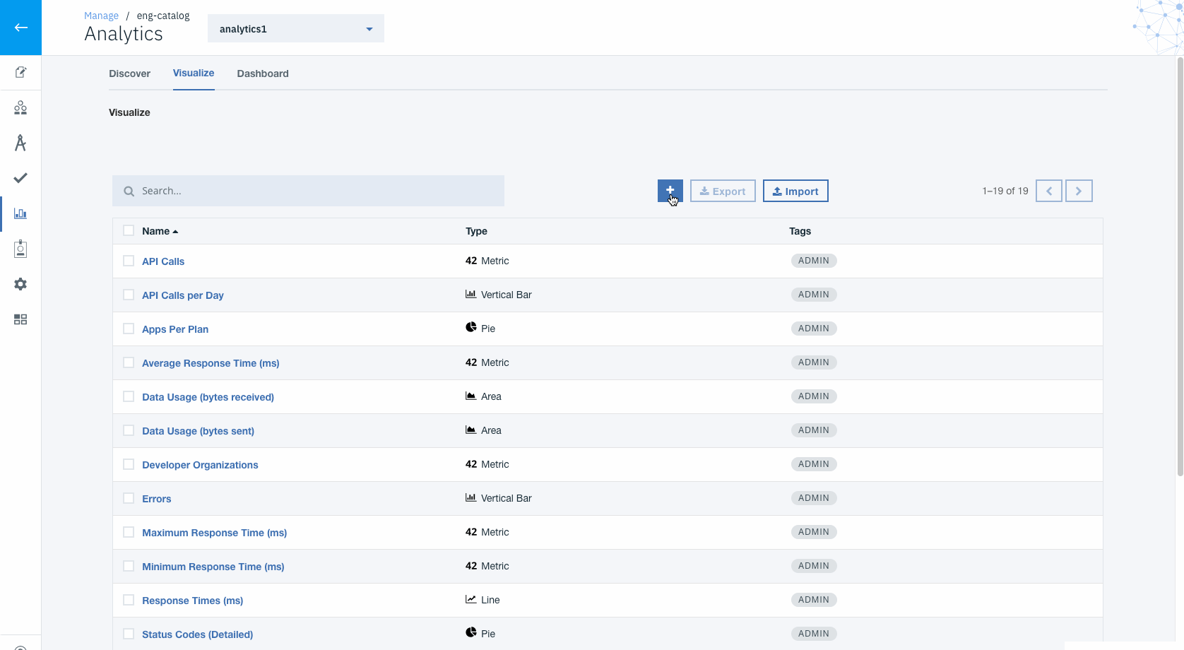
Let us continue and create a new visualization based on the search we created in the previous section. Navigate to the
Visualize tab, by clicking the
Visualize tab at the top of the analytics page. To create a new visualization click the
+ just above the table. Here, you will be presented with a gallery of different visualization types. Select the
Metric tile, which will take you to the
Choose Search Source page. When creating a new visualization you have two options. On the left-hand side, you can base it on a new search similar to the one we created in the search section above. On the right-hand side, you can select a saved-search, which is what we will be doing. In the right-hand table select the
Watches search that we created previously. Once selected, you will then be presented with the visualization editor. We will keep all the defaults and click
Save from the toolbar. Name our visualization
Watches Count, and click the Save button. Now navigate back to the Visualize landing page by clicking the
Visualize tab at the top of the analytics page. You will notice the visualization we just created is listed in the table.
Dashboard
The Dashboard application allows you to compile visualizations into meaningful representations of your data. A dashboard is comprised of one to many different visualizations or searches and can be arranged and resized to meet your specific needs.
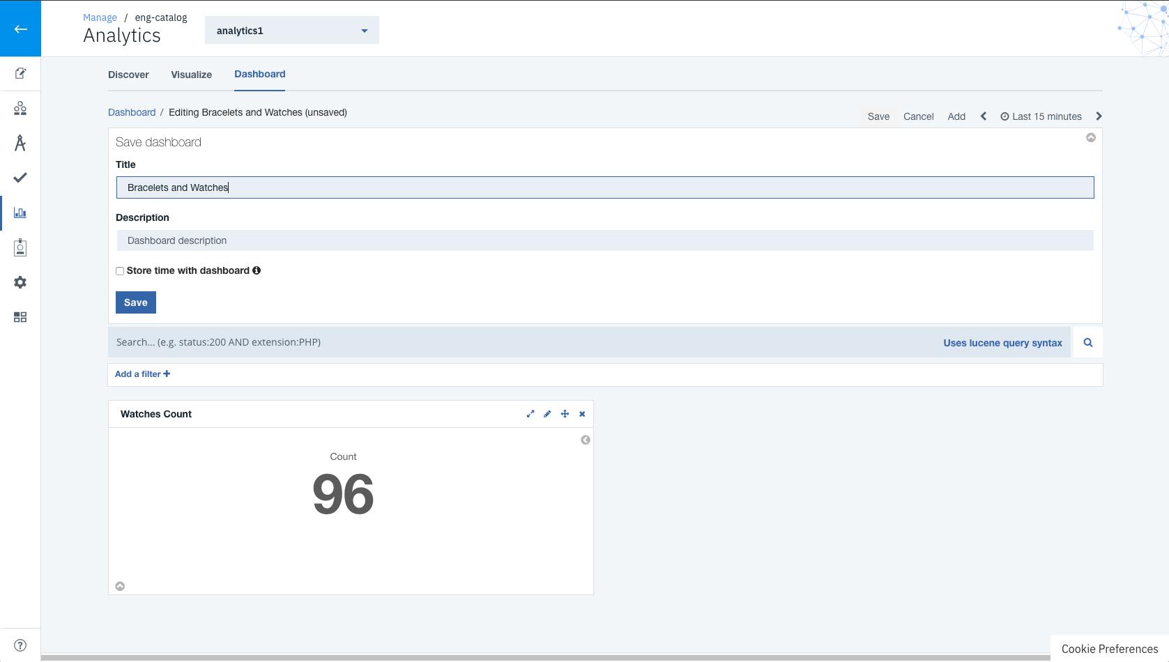
For the final step, we will incorporate our new visualization based on our custom search to a new dashboard. Navigate to the
Dashboards tab, by clicking the
Dashboards tab at the top of the analytics page. To create a new dashboard click the
+ just above the table. This will take you to an empty unsaved dashboard. Click on the
Add Button in the top toolbar, and this should open the
Add Panels pane. You can scroll down and find our visualization
Watches Count and select it. This will add the visualization to the dashboard. Now you can click the
Add button once again to close the
Add Panels pane. Now we can click the
Save button from the toolbar and name the dashboard
Bracelets and Watches. Finally, click the
Save button to save our dashboard. Now navigate back to the Dashboard landing page by clicking the
Dashboard tab at the top of the analytics page. You will notice the dashboard we just created is listed in the table.
Conclusion
Now you should have a broad understanding on how to maneuver through a typical workflow. We have successfully worked through each application in analytics. This allowed us to create a saved search, create a visualization based on that search, and create a dashboard using that visualization. In subsequent posts, we will take a deeper dive into each application and explore some more advanced features.
#GettingStarted#APIConnectv.2018.1#APIDevelopers#MicroservicesArchitecture#BusinessStrategy