STUMPER: Pre-solved Q&A to sharpen your TBM and Apptio skills.
Solution posted in 7 days if nobody submits a correct answer.
See title for rating: [+] Easy [++] Moderate [+++] Challenging
I've been working on a server report. One of its components is this pie chart:
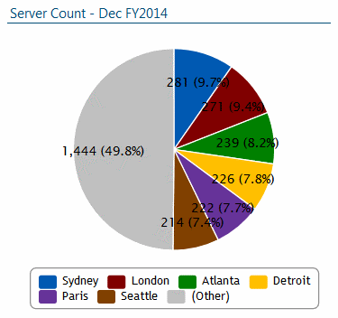
So far so good--except for that (Other) category in gray.
When I highlight the pie chart, I see this as its configuration dialog:
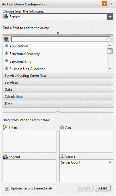
That field in the Values area is a metric called Server Count.
Here are its details as seen from the Metrics tab:
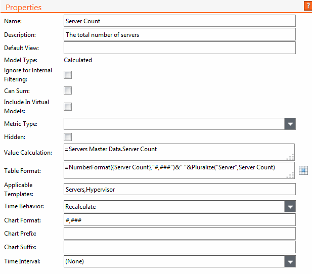
This metric's Value Calculation formula references the Server Count column in the Servers Master Data set.
As it turns out, this column's value is being set in the master data set's mapping configuration area:
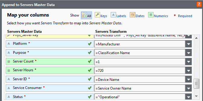
Its value is being set to 1 for every row in the Servers Master Data set.
And finally, if I head to the Data tab, select the Servers Master Data set, right-click the Location column and select Show Unique Values, I see:
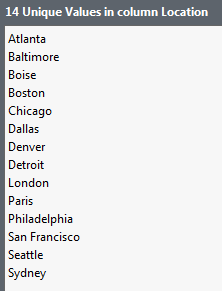
...in other words, every row in this data table has a unique Location value.
No {Various} or Other or (Other) or anything like that.
I want to see all 14 categories in my pie chart.
Why am I seeing (Other) in the chart, and how can I get rid of it?