You might be able to use an overlay chart to display this data. Overlays give you the option of showing 2 separate axes (one on the left, one on the right) that are independent of each other, so in your example, your device count axis would scale up from 0 to 5000, and your device per headcount axis would go from 0 to 0.5.
The one thing to keep in mind if you do use this though, is that overlays use a combination of bar charts and line charts to display the data. This can potentially lead to a bit of confusion since we tend to think of line charts as representing trends over time. But with a little bit of user training so that everyone understands this caveat, you should be able to overcome this.
Original Message:
Sent: 11-23-2020 16:33
From: Supriya Sukumaran
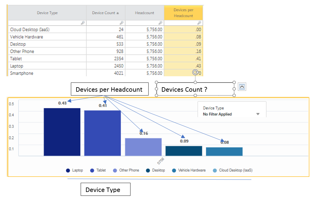
Subject: Bar chart Question
Hello,
I was trying to create a bar chart on 'Device Type', 'Device Count' and 'Devices per Headcount'. I couldn't display both 'Device count' and 'Devices per headcount' in the same chart effectively due to big difference in scale measurement. Is there a way I can use tooltip option to display 'Device Count' when I hover over each 'Device Type'? Or Is there a way I can represent both 'Device Count' and 'Devices Per Headcount' in the same chart?
#CostingStandard(CT-Foundation)