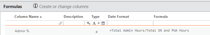
I was able to do this by creating a metric. While the formulas existed in the actual table, the chart will not work with the columns being brought into the report. It will only work by bringing in the metric into the report.
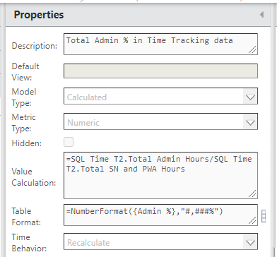
You can see from the below that the formula is the same, but you must use the metric.
Formula column in SQL Time T2 table:
Metric for Admin %:
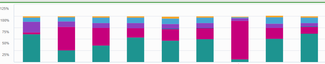
Result: