An introduction to Scatter Plots, how they display certain types of data, and configuration instructions to make your own within TBM Studio. This post is part of a series:
Concept
Use a scatter plot to graphically summarize the relationship between two variables (X and Y) within a data set.
Good for quickly determining:
- Are X and Y related? If so, how?
- Does variation of Y change depending on X?
- Outliers
Examples
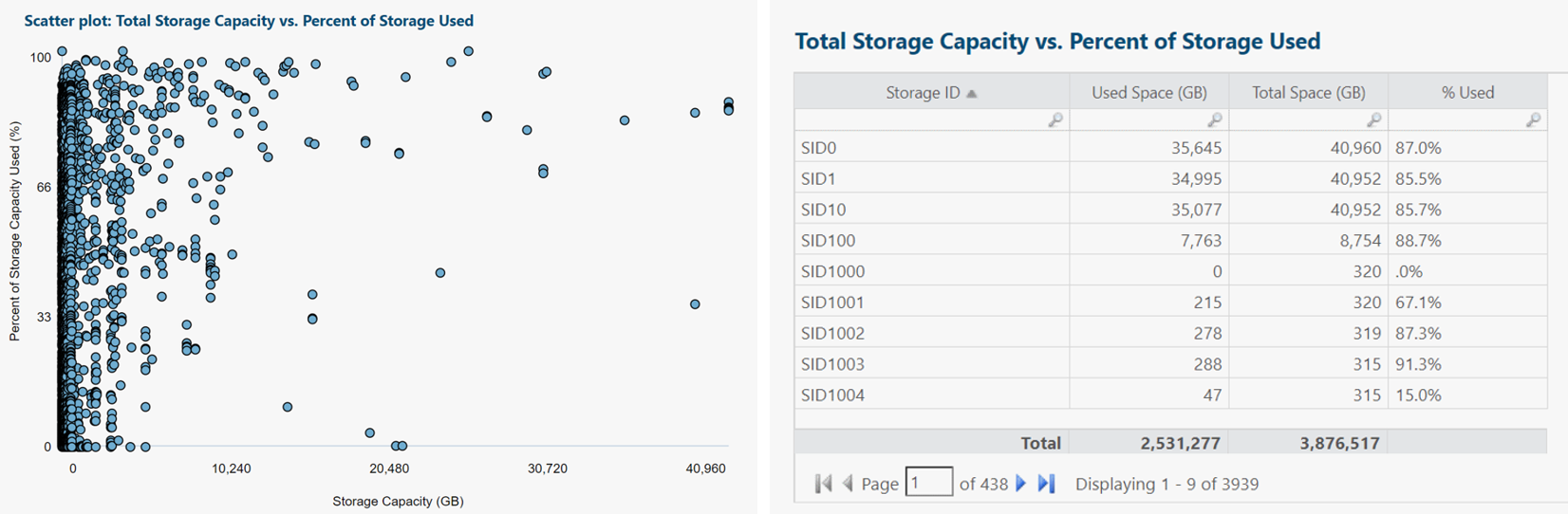
Each blue dot represents one storage device.
Insights and questions from above scatter plot:
- Highest concentration of storage devices is under 10 TB each, especially under 5 TB.
- As capacity rises, so does % utilization. Suggests we're making good use of our higher-capacity (higher-cost) storage.
- Probably should look into outliers (bottom center: high capacity, low utilization).
- Useful to re-run analysis, categorized by storage type/tier or type of app/service supported.
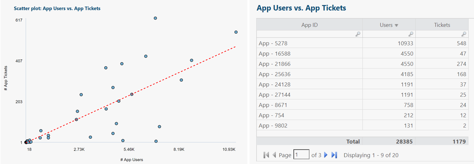
Each blue dot represents one application.
Linear regression trend shown in red.
Insights and questions from above scatter plot:
- Regression trend matches expectations: As number of app users rises, so does number of app tickets.
- Regression line can predict number of tickets for a yet-to-be-released app, if we can estimate its number of users ahead of time. This can assist with forecasting help desk needs for future time periods.
- As number of app users increases, variability (min-to-max range) of number of app tickets increases.
- Probably should look into outliers (apps that stray far from the regression trend line).
- Some apps share similar number of users but very different number of tickets. Could investigate why: More app end user training needed?
- Useful to re-run analysis, categorized by number of employees reporting tickets (perhaps a small number of users are responsible for a relatively large number of tickets).
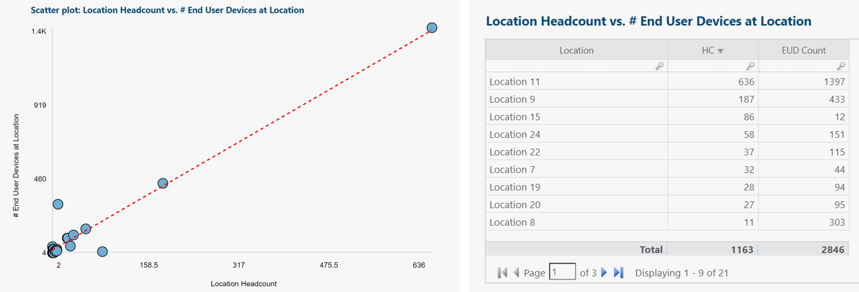
Each blue dot represents one location.
Linear regression trend shown in red.
Insights and questions from above scatter plot:
- Regression trend matches expectations: As headcount rises, so does number of end user devices.
- Regression line can predict number of end user devices for a yet-to-be-established location, if we can estimate its headcount ahead of time. This can assist with forecasting end user device budget needs for future time periods.
- Regression trend fits most locations very well, suggesting we should probably look into the two visually obvious outliers.
- Useful to re-run analysis, categorized by end user device type or location type.
Scatter plots in R12
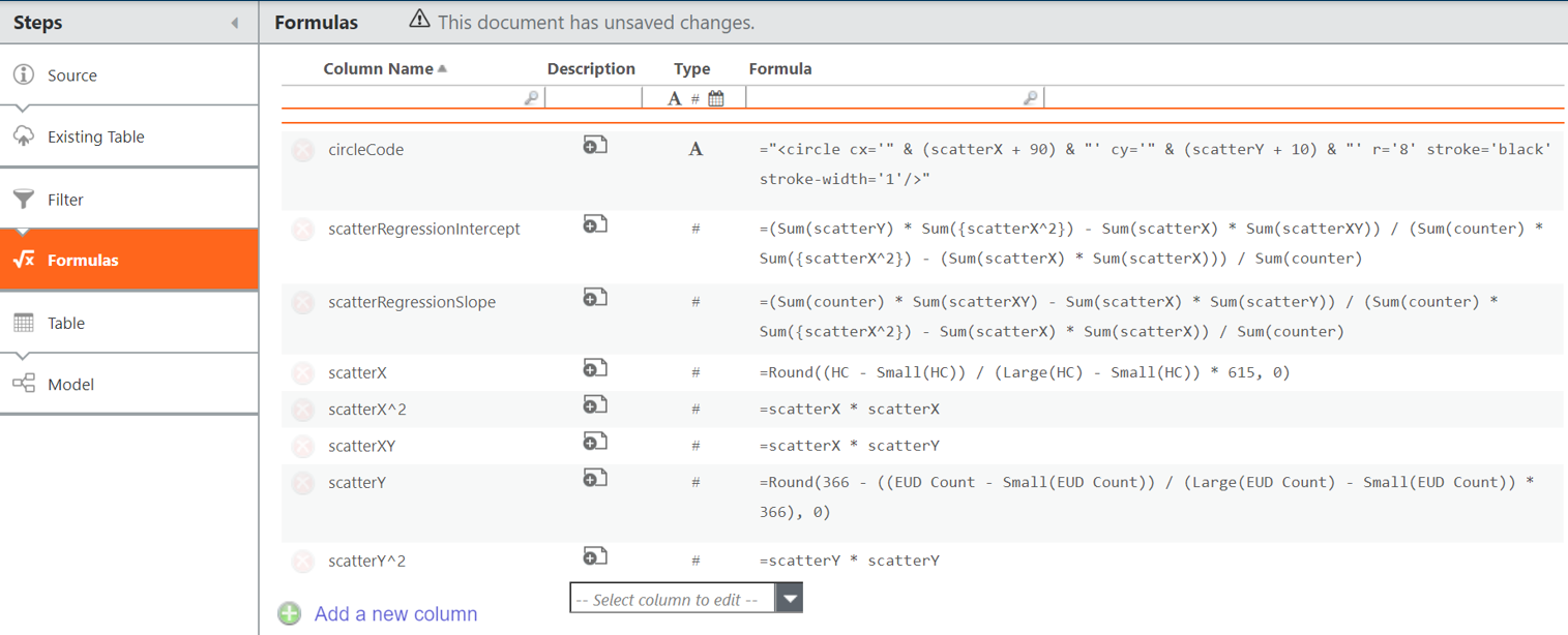
Add the columns above to Formulas transform pipeline step in data table.
For example, if headcount (HC) and end user device count (EUD Count) are two variables of interest:
counter = 1
scatterX = Round((HC - Small(HC)) / (Large(HC) - Small(HC)) * 615, 0)
scatterY = Round(366 - ((EUD Count - Small(EUD Count)) / (Large(EUD Count) - Small(EUD Count)) * 366), 0)
circleCode = "<circle cx='" & (scatterX + 90) & "' cy='" & (scatterY + 10) & "' r='8' stroke='black' stroke-width='1'/>"
And if we want to plot a regression trend line, also include:
scatterX^2 =scatterX * scatterX
scatterY^2 =scatterY * scatterY
scatterXY = scatterX * scatterY
scatterRegressionIntercept = (Sum(scatterY) * Sum({scatterX^2}) - Sum(scatterX) * Sum(scatterXY)) / (Sum(counter) * Sum({scatterX^2}) - (Sum(scatterX) * Sum(scatterX))) / Sum(counter)
scatterRegressionSlope = (Sum(counter) * Sum(scatterXY) - Sum(scatterX) * Sum(scatterY)) / (Sum(counter) * Sum({scatterX^2}) - Sum(scatterX) * Sum(scatterX)) / Sum(counter)
Then in the report editor:
(top Ribbon) > Report > HTML
Drag at least one (arbitrary) column from your modeled data table in Project Explorer to Rows section of HTML configuration panel.
This locks the object context of the HTML component.
For example, if our data table containing a Model transform pipeline step is called EUD Sample, we could drag EUD Sample.Location from Project Explorer to Rows area.
Paste the code below (modify as needed) into the HTML content window.
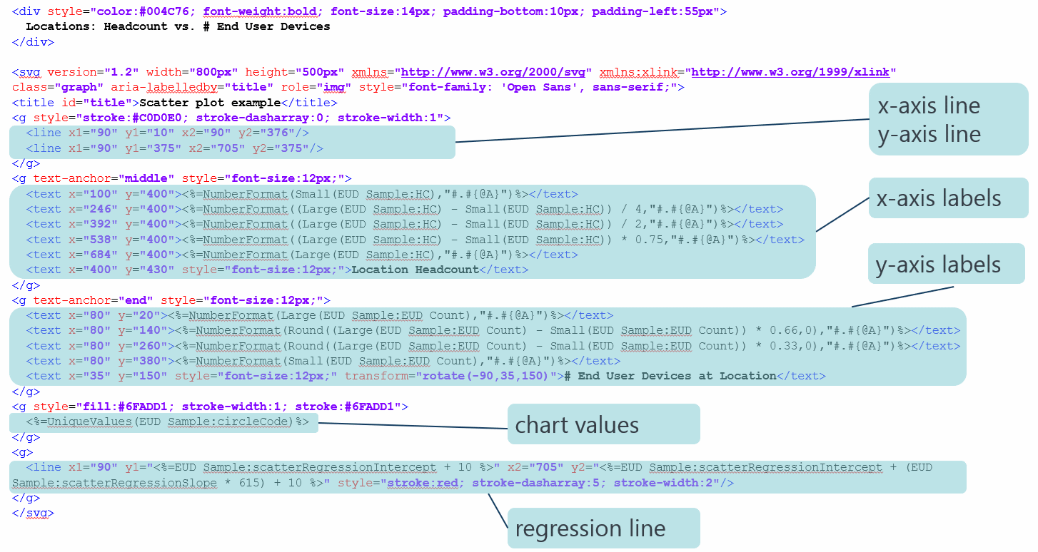
Same code again, this time in a ready-to-copy format:
<div style="color:#004C76; font-weight:bold; font-size:14px; padding-bottom:10px; padding-left:55px">
 Scatter plot: Location Headcount vs. # End User Devices at Location
</div>

<svg version="1.2" width="800px" height="500px" xmlns="http://www.w3.org/2000/svg" xmlns:xlink="http://www.w3.org/1999/xlink" class="graph" aria-labelledby="title" role="img"style="font-family: 'Open Sans', sans-serif;">
<title id="title">Scatter plot example</title>
<g style="stroke:#C0D0E0; stroke-dasharray:0; stroke-width:1">
 <line x1="90" y1="10" x2="90" y2="376"/>
 <line x1="90" y1="375" x2="705" y2="375"/>
</g>
<g text-anchor="middle" style="font-size:12px;">
 <text x="100" y="400"><%=NumberFormat(Small(EUD Sample V2:HC),"#.#{@A}")%></text>
 <text x="246" y="400"><%=NumberFormat((Large(EUD Sample V2:HC) - Small(EUD Sample V2:HC)) / 4,"#.#{@A}")%></text>
 <text x="392" y="400"><%=NumberFormat((Large(EUD Sample V2:HC) - Small(EUD Sample V2:HC)) / 2,"#.#{@A}")%></text>
 <text x="538" y="400"><%=NumberFormat((Large(EUD Sample V2:HC) - Small(EUD Sample V2:HC)) * 0.75,"#.#{@A}")%></text>
 <text x="684" y="400"><%=NumberFormat(Large(EUD Sample V2:HC),"#.#{@A}")%></text>
 <text x="400" y="430"style="font-size:12px;">Location Headcount</text>
</g>
<g text-anchor="end" style="font-size:12px;">
 <text x="80" y="20"><%=NumberFormat(Large(EUD Sample V2:EUD Count),"#.#{@A}")%></text>
 <text x="80" y="140"><%=NumberFormat(Round((Large(EUD Sample V2:EUD Count) - Small(EUD Sample V2:EUD Count)) * 0.66,0),"#.#{@A}")%></text>
 <text x="80" y="260"><%=NumberFormat(Round((Large(EUD Sample V2:EUD Count) - Small(EUD Sample V2:EUD Count)) * 0.33,0),"#.#{@A}")%></text>
 <text x="80" y="380"><%=NumberFormat(Small(EUD Sample V2:EUD Count),"#.#{@A}")%></text>
 <text x="35" y="150"style="font-size:12px;" transform="rotate(-90,35,150)"># End User Devices at Location</text>
</g>
<g style="fill:#6FADD1; stroke-width:1; stroke:#6FADD1">
 <%=UniqueValues(EUD Sample V2:circleCode)%>
</g>
<g>
 <line x1="90" y1="<%=EUD Sample V2:scatterRegressionIntercept + 10 %>" x2="705" y2="<%=EUD Sample V2:scatterRegressionIntercept + (EUD Sample V2:scatterRegressionSlope * 615) + 10 %>"style="stroke:red; stroke-dasharray:5; stroke-width:2"/>
</g>
</svg>