This post is part of a series:
Concept
Use summary statistics to describe primary characteristics of a single variable within a data set.
Good for quickly displaying:
- n (number of values)
- min, max, mean (average)
- lower quartile Q1 = 25th percentile
- middle quartile Q2 = 50th percentile = median
- upper quartile Q3 = 75th percentile
- standard deviation, variance
- outliers
Examples
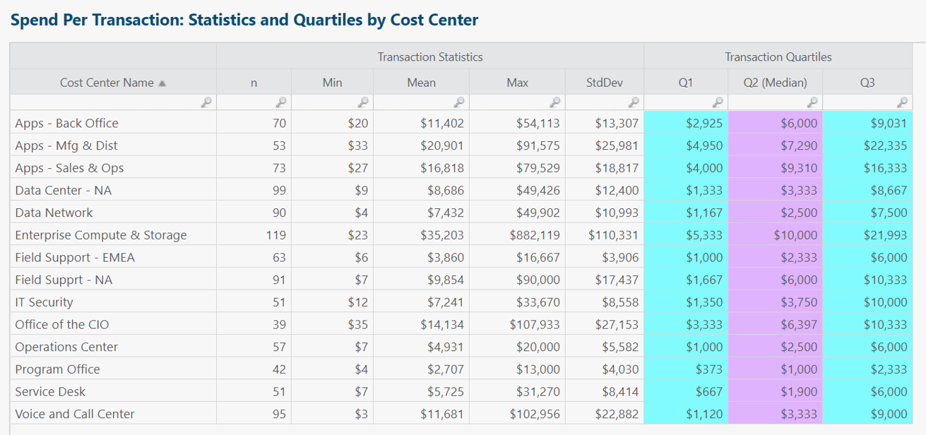
Each table row summarizes monthly transactions for a single cost center.
Insights and questions from above table:
- Plenty of valid reasons why some cost centers would have higher n (number of transactions) than other cost centers. Same story for min/mean/max and the others. Table meant to provide high-level statistical summary and jumping-off point for further analysis.
- In all rows, median < mean, sometimes substantially so. Implies cost centers have way more small than large transactions.
- Enterprise Compute & Storage has relatively high n and standard deviation. Worth analyzing further. Variable cost is a marker of IT agility, but could this cost center owner explore potential for consolidating transactions or purchase orders?
- Useful to add coefficient of variation (stdDev/mean) column to normalize magnitude differences between cost centers.
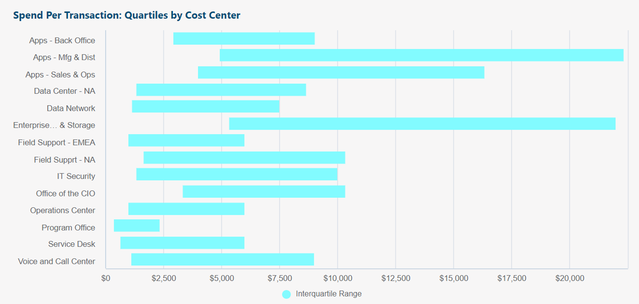
Same source data as original table above.
Box chart shows interquartile range (Q1 to Q3) of transactions per cost center.
Insights and questions from above box chart:
- Purpose of chart is at-a-glance visual comparison of "normal" (1st to 3rd quartile) non-outlier transaction amounts per cost center.
- Wider bars indicate larger variability of transaction amounts.
- Program Office for example has the smallest variability of transaction amounts: Most of its transactions are $400 to $2,000 each.
- If any ranges are higher, lower, wider, or shorter than our expectations, useful to follow up with further analysis.
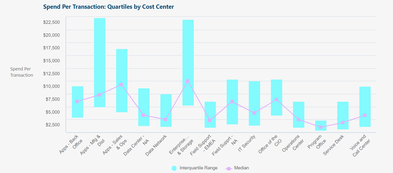
Same as previous example, but vertical box chart + line chart overlay, instead of horizontal box chart.
Overlay lets us add an additional value (such as median).
Same source data as original table above.
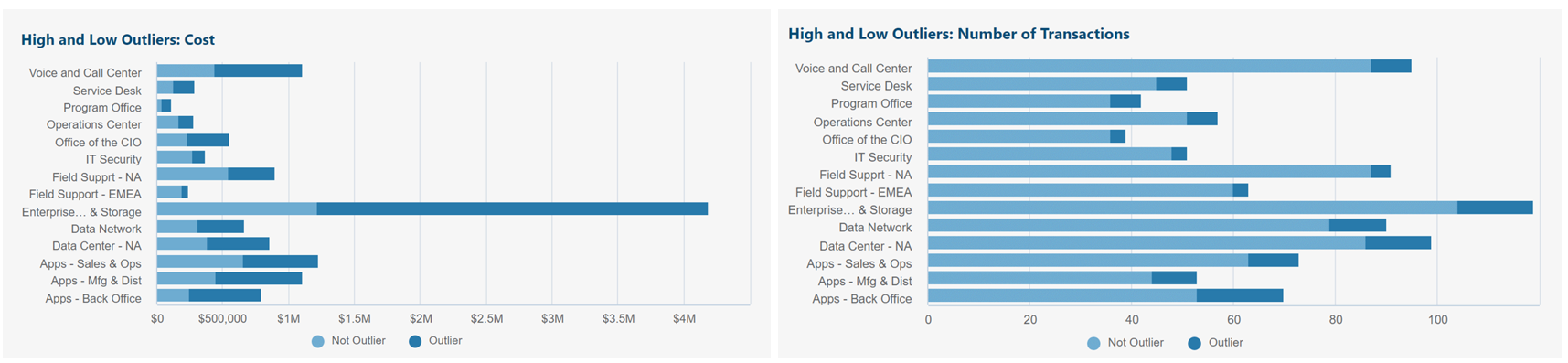
Outlier categorization method used:
- Interquartile range (IQR) = Q3 - Q1
- High outlier: Greater than Q3 + (IQR x 1.5)
- Low outlier: Less than Q1 - (IQR x 1.5)
Above left chart shows outliers vs. normal: Total monthly cost per cost center.
Above right chart shows outliers vs. normal: Total monthly number of transactions per cost center.
Insights and questions from above charts:
- Enterprise Compute and Storage has a small number of outlier transactions, but these outliers are accounting for the majority of the cost. Useful to research further.
- Same story for Voice and Call Center, Service Desk, Apps - Back Office, etc.
Summary statistics in R12
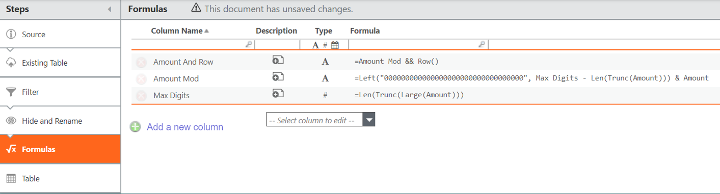
Add the columns above to Formulas transform pipeline step in data table.
For example, if Amount is variable of interest:
Max Digits = Len(Trunc(Large(Amount)))
Amount Mod = Left("000000000000000000000000000000000", Max Digits - Len(Trunc(Amount))) & Amount
Amount And Row = Amount Mod && Row()
Right-click Table step > Create new table from this step.
In the newly created transform table, add the columns above to Formulas transform pipeline step.
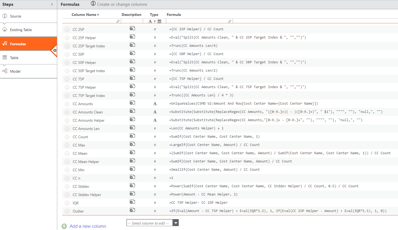
For example, if Cost Center Name is the category we want to pivot Amount value by:
CC n = 1
CC Count = SumIf(Cost Center Name, Cost Center Name, 1)
CC Min = SmallIf(Cost Center Name, Amount) / CC Count
CC Max = LargeIf(Cost Center Name, Amount) / CC Count
CC Mean = (SumIf(Cost Center Name, Cost Center Name, Amount) / SumIf(Cost Center Name, Cost Center Name, 1)) / CC Count
CC Mean Helper = SumIf(Cost Center Name, Cost Center Name, Amount) / CC Count
CC Stddev Helper = Power(Amount - CC Mean Helper, 2)
CC Stddev = Power(SumIf(Cost Center Name, Cost Center Name, CC Stddev Helper) / CC Count, 0.5) / CC Count
CC Amounts (label) = UniqueValues(Cost Source Table:Amount And Row[Cost Center Name={Cost Center Name}])
CC Amounts Clean (label) = Substitute(Substitute(ReplaceRegex(CC Amounts, "([0-9.]+)( - )([0-9.]+)", " $1"), """", ""), "null,", "")
CC Amounts Helper (label) = Substitute(Substitute(ReplaceRegex(CC Amounts,"[0-9.]+ - [0-9.]+", ""), """", ""), "null,", "")
CC Amounts Len = Len(CC Amounts Helper) + 1
Note: UniqueValues() compresses identical-value transactions into one entry, so we used Row() and Amount Mod to ensure these stay separately counted.
CC 25P Target Index = Trunc(CC Amounts Len/4)
CC 25P Helper = Eval("Split(CC Amounts Clean, " & CC 25P Target Index & ", "","")")
CC 25P = {CC 25P Helper} / CC Count
Note: CC 25P (25th percentile) = lower quartile (Q1)
CC 50P Target Index = Trunc(CC Amounts Len/2)
CC 50P Helper = Eval("Split(CC Amounts Clean, " & CC 50P Target Index & ", "","")")
CC 50P ={CC 50P Helper} / CC Count
Median = CC 50P
Note: CC 50P (50th percentile) = middle quartile (Q2) = median
CC 75P Target Index = Trunc({CC Amounts Len} / 4 * 3)
CC 75P Helper = Eval("Split(CC Amounts Clean, " & CC 75P Target Index & ", "","")")
CC 75P = {CC 75P Helper} / CC Count
Note: CC 75P (75th percentile) = upper quartile (Q3)
IQR = CC 75P Helper- CC 25P Helper
Interquartile Range = IQR / CC Count
Outlier = If(Eval(Amount - CC 75P Helper) > Eval(IQR*1.5), 1, If(Eval(CC 25P Helper - Amount) > Eval(IQR*1.5), 1, 0))
Note: Place Outlier in chart legend to separate outlier from non-outlier values.
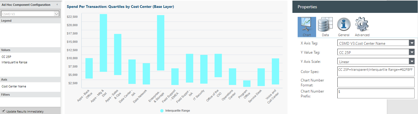
To create floating columns (box chart style) seen above:
Values: CC 25P
Values: Interquartile Range
Axis: Cost Center Name
Chart properties > Color spec: CC 25P=transparent;Interquartile Range=#82FBFF