I searched the discussions for keywords on data aliases, boxplot, divergent bar graph, but did not find anything.
A) I need to know how to give data values alias names on a graph so that data that has values 0, 1, and 2 can be graphed and instead of the Y or X axis showing 0 1 and 2, I could right click on the axis and give aliases of the appropriate words such as "Online Learner", "Resident" and "Commuter" if the question was about where the student was living.
B) How can we make a boxplot - these are critical to displaying data distributions in a compact understandable way, with data like ACT scores and comparing various attributes of an incoming class or previous year's classes, I can do them in Tableau and they are available as visuals in PowerBI
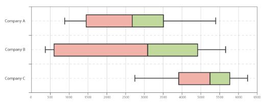
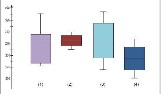 C)
C) How can we make divergent stacked bar graphs [akin to a tornado graph] -- these are exceedingly helpful when displaying scale results, such as data from likert scale survey questions and very necessary for showing an admissions funnel-- I learned how to manipulate Tableau to do them, but I am not seeing this option in cognos analytics - I have a workaround that I can try but this should just be a ready to go visual or there should be a setting to "diverge" a stacked bar graph

------------------------------
JR Malone
------------------------------
#CognosAnalyticswithWatson