Cognos Analytics 11.0.5 is another great release full of features to help users better interact and visualize their data. You’ll find many new enhancements ranging from small usability tweaks to larger enhancements such as accessing FM Packages in your dashboards and of course our new mapping solution! Keep on reading, I’m sure you’ll find lots to love in this release.
Direct access to relational Framework Manager packagesWe are thrilled to now provide direct access to your relational Framework Manager (FM) packages in dashboards. Simply select your package and off you go, no need to create a data set if you do not want to.
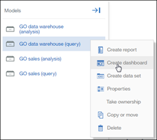
The FM package will display in the tree on the left, allow the user to simply drag and drop the fields right onto the canvas, like with any other source.
In the screenshot below, I have selected the FM package called GO data warehouse (query) and expanded the folders to then drag and drop fields onto the canvas, including tricky ones like prompted fields, stand-alone filters and calculations.
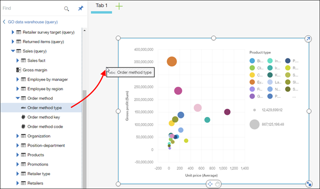
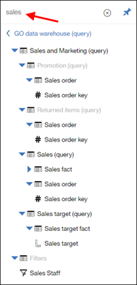
One of my favorite capabilities is the Find above the metadata tree. I can filter my tree to only show the entries that match what I typed. It makes it a lot easier to find the fields that I’m interested in.
One important point to note is that these relational packages must be published as either as DQM or connect to a JDBC datasource. Meaning that for CQM packages, your admin will need to add a JDBC connection to the datasource in order for the dashboard to be able to use it.
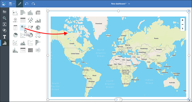
New MapsIn August IBM announced a
partnership with Mapbox and also with Pitney Bowes to enable IBM to deliver a best of class map visualizations and interactivity. As part of 11.0.5, we are introducing these new maps in the dashboard. You can either drag in the new Map widget or take your geo information such as countries and states/provinces and drag it into the canvas, you will now see a new map! From there you can pan and zoom to show all the details.
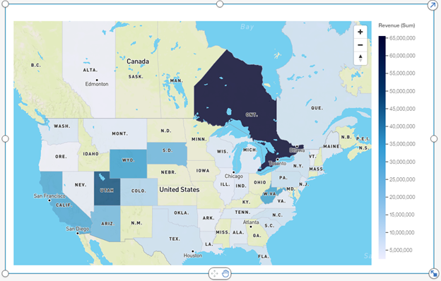
The data slot accepts country names or states and provinces around the world. For example, if I drag states and a few Canadian provinces as well as revenue for my products, the map will create a choropleth.
If I also want to look at Gross Profit and Percent Profit per region, I can drag both directly onto the map to create bubbles with color gradient.
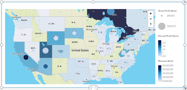
My map now shows the revenue per region via the choropleth, my bubbles size representing my Gross Profit and colored by the Percent Profit.
The colored regions of the map are interactive and can be selected to filter other visualizations, drill down to another level, include or exclude.
 New visualization engine with pan and zoom
As soon as you create a new chart and start interacting with it, you’ll notice a new look and feel. We’ve introduced our new visualization engine called RAVE2 as part of dashboards. Your existing dashboards will automatically be updated to use the new charts, giving you access to the new features immediately.
You’ll also notice the new toggle grabber at the bottom of each visualization. This toggle allows you to set it to either move, or pan inside the visualization. For example, in a bubble chart where the bubbles are at times super-imposed, you can now zoom in and see more details. Below is a bubble chart where the bubbles are too closely jammed together for me to clearly see each circle. Now I can simply click on the little toggle to zoom and pan around the visualization, essentially locking the widget in place:
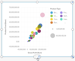
Once the little pan icon is selected, it allows me to zoom using my mouse or trackpad as well as panning around the viz by click and holding the inside of the viz.
Navigation pathsNavigation paths allow the user to explore their data in a new and exciting way. To see how to define them, head over to
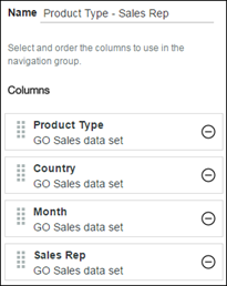
Jason’s blog post on Data Modules. The reason why navigation paths are different is that not only can they cover what traditional hierarchies can, but also offers much greater flexibility. For example, a user that needs to be able to drill from Year to Quarter to Month will obviously still be able to do this. However with navigation paths, they can jump from Year to Months, skipping levels, or even define additional paths that will allow them to do data exploration in a new and innovative way. Why not create one that will allow the user to go from Product to Country to Months and finally to Sales Reps? This path will provide the ability for the user to see their data in whole different ways.
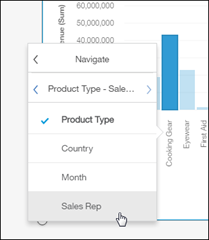
Below is a screenshot of my data module, where I have defined this navigation path:
This path all of a sudden opens the door to be able to quickly jump between these items to get some answers to questions such as:
- Which products were sold in the UK by a particular sales rep?
- For the months of November and December, which product sold the most, and who sold them?
The user can just as easily navigate in one direction or the other, passing context to each level.
Select any data point that is part of the navigation group and from the on-demand toolbar, select to drill-down.
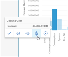
To jump to another level or to go to another navigation group, select the navigate button. This will expose the path and indicate where you are as part of it. From here I can jump directly to show the Sales Reps who sold the Cooking gear.
When a field is part of multiple navigation groups, the user can switch between them by clicking on the little arrow beside its name.
 Clear filters from any visualization
Here’s a small change with a large impact, the user now has the ability to clear any filters from the little pop up on the top right of any visualization. This becomes particularly useful when you have many widgets on the screen where the user has selected a few values. I think we all have gotten into situations where we can’t remember how to unselect certain values! Now, clearing filters is a simple click.
In the screenshot below, I’ve filtered the column chart based on the Camping Equipment selection in the list beside it. To remove the filter, now I have the option of simply clicking on the little X as part of the pop up. This will clear the filter for all widgets that were filtered by the selection.
 Pinned headers in crosstabs
This one makes a big difference in the way you interact with your data. The column and row headers are now pinned automatically on crosstab, allowing you to freely scroll left, right, up and down without losing context of the values you are looking at. Notice in the screenshot below that I have fully scrolled to the bottom right of the crosstab and the headers are still perfectly visible.
 Extensions
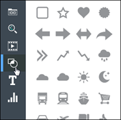
An admin can now import extensions into the dashboard that will appear as new widgets where the user can drag them onto the canvas. These extensions can be new shapes that will appear in the library of available ones:
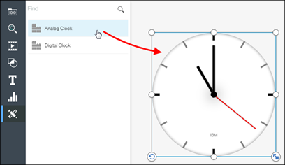
Or the admin can develop an entirely new widget that will appear as its own icon. Import the zip file from the Manage tab and the dashboard will have a new icon on the left with the new widgets. In the screenshot below, I imported two custom widgets for an analog and a digital clock. When I drag them onto the canvas, they become normal widgets that behave like any other widgets. They are fully interactive, based on the JavaScript that was used to define them.
My example above is a simple one, but perhaps you can define something more impactful to your business such as a fully interactive widget that tracks info from another system, a mechanism to launch background system tasks, a Twitter feed, news aggregator, alerts, weather info, etc. The examples are endless; it is completely up to you to decide what you’d like to place in there.
Related post: Video: What's New in Dashboarding for IBM Cognos Analytics 11.0.5?#11.0.5#CognosAnalytics#CognosAnalyticswithWatson#createBoard#dashboard#home#LearnCognosAnalytics