Looking for a Population, custom Waterfall, Gantt, Gas Gauge or an advanced Sankey? Then take a look at the Accelerator Catalog!
Today, we have published a handful of new visualizations to the catalog - these are samples that are ready to use, but we also share the source code so you can modify them to support your needs... at the same time, we have also changed the Download button to directly download the packed zip file - ready to upload to Cognos Analytics. If you want to take a look at the source code, there are links to the Github repository and the documentation for each sample.
Let's take a look at them:
Sankey:
We already had a Sankey example as part of the 11.1.4 release of the custom visualization - We have updated it to support multiple steps and a more controlled color schema and included a lot more properties, like node width, padding, fill type etc. There is a From and a To data slot, so data needs to be stacked in order to have multiple "steps" - take a look at the sample data that comes with the bundle.
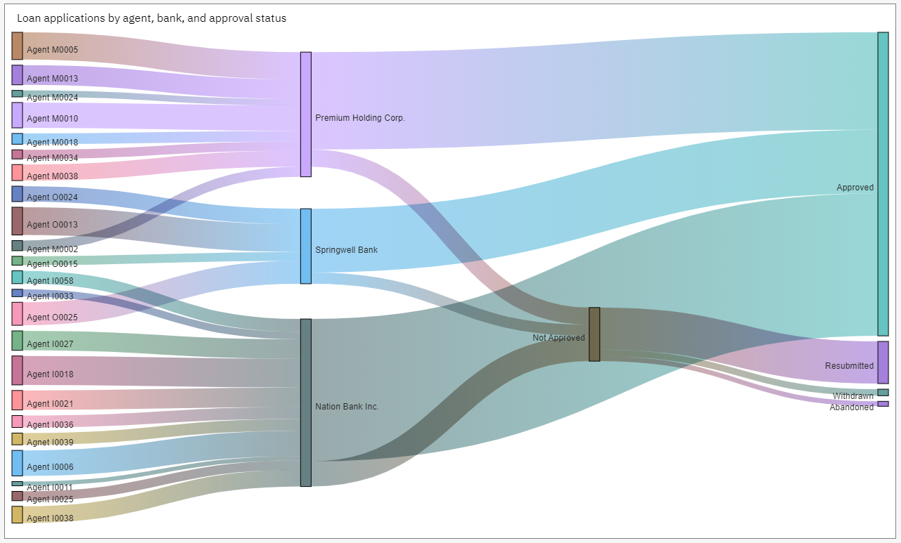 https://community.ibm.com/accelerators/catalog/content/Sankey
Gantt:
Then one of my personal favorites... also requested by a lot of Planning Analytics users... the Gantt visualization!
There are lot of use cases for the Gantt - typically used with project organizations, like the example below but it can also be used for utilization of equipment over the full day... like what are my 32 trucks doing over 24 hour. There is a data slot for the labels and you can adjust the background on the labels. Overlapping activities are marked with an arrow. Source code is available, if you want to adjust this sample.
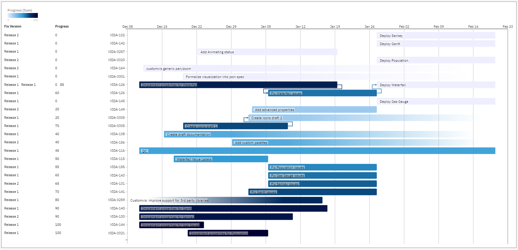 https://community.ibm.com/accelerators/catalog/content/Gantt
Population:
Next one is the Population visualization, also sometimes referred to a Pyramid visualization (depending on the configuration). It's 2 histograms compared back-to-back, excellent to show distribution for 2 outcomes like male/female or comparing 2 regions etc. One of the important properties here is to adjust where the y-axis should be. At left or in the middle.
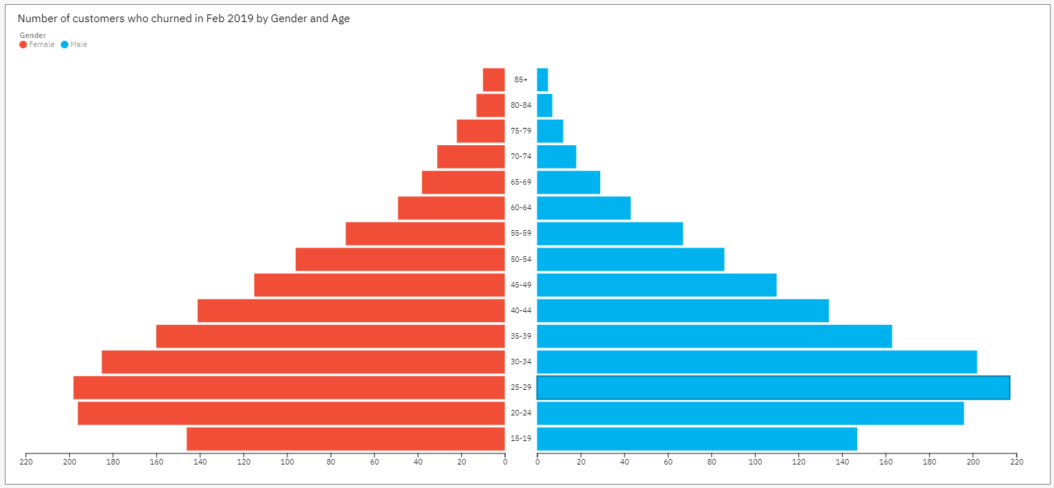 https://community.ibm.com/accelerators/catalog/content/Population
Gas Gauge:
Another popular visualization, specially for dashboards - excellent to give a quick status on a single KPI against target. This sample have a lot of properties that can be adjusted - you can see them all in reporting, some of them are not available in R6 in dashboards but will be in R7. So take a look today and look forward to the full experience for dashboards in R7. You can design the Gas Gauge to be a full circle, ½ circle or a 257 degrees angle ;-) and you can customize the border, red/yellow/green arcs and several other properties. Below is just 2 examples...
https://community.ibm.com/accelerators/catalog/content/Gas-gauge
Waterfall:
Lastly, we also added a custom Waterfall as an example of what you can do with custom visualizations. We already have a Waterfall as part of Cognos Analytics (which is also going to be updated in R7 to support sub-categories) but we have heard requests for additions to the Waterfall that are very customer specific... There are many variations of the Waterfall visualizations out there, so this example is to help you with building your own version if you have very specific needs like the arrows, jumps in the intervals and labels. Is it not meant as a "ready-to-use-in-production" but more to get you started with your own versions.
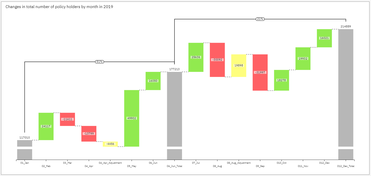 https://community.ibm.com/accelerators/catalog/content/Waterfall
We have more examples coming to the Accelerator Catalog soon, including examples from our Business Partners - these will be some other very popular ones including examples of how to use Google charts, High Charts etc. Keep an eye out for the next blog update around custom visualizations!
Finally - we welcome your inputs on what we should focus on for the next xx number of releases for the Accelerator Catalog - please share your thoughts below in the comment field
Torben
#CognosAnalyticswithWatson#Customvis#D3#dashboard#DataVisualization#GasGauge#home#LearnCognosAnalytics#report#visualizations