R. Williams outlines four design principles in The Non-Designer's Design Book which can help improve your Apptio reports by making data-related insights and trends easier to summarize and understand.
Try these quick ideas when you build or edit reports:
1. CONTRAST
2. REPETITION
3. ALIGNMENT
4. PROXIMITY
Click any image below to enlarge.
1. CONTRAST
Visually separate different report elements as much as possible.
Assign greater importance (using color and font size) to key metrics and trends of specific interest.
Reduce the number of colors and font styles to as few as possible.
CONTRAST EXAMPLE 1 (BEFORE)

CONTRAST EXAMPLE 1 (AFTER)

CONTRAST EXAMPLE 2 (BEFORE)

CONTRAST EXAMPLE 2 (AFTER)

2. REPETITION
Use repeating design elements to break up and simplify large numbers of tables and charts.
Be consistent with size, style, and formatting of components within a report and across multiple reports.
REPETITION EXAMPLE 1 (BEFORE)

REPETITION EXAMPLE 1 (AFTER)

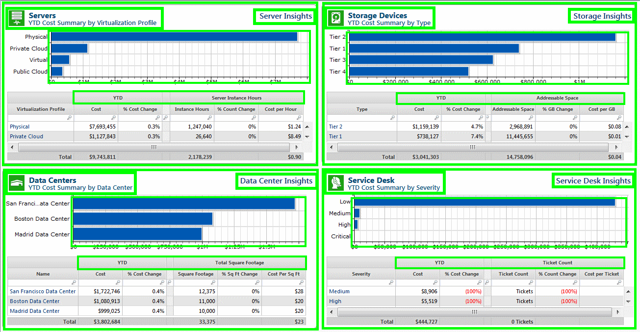
REPETITION EXAMPLE 1 (WHAT WAS REPEATED)
REPETITION EXAMPLE 2 (BEFORE): CAPEX AND OPEX COLORS NOT CONSISTENT

REPETITION EXAMPLE 2 (AFTER)

3. ALIGNMENT
Horizontally and vertically align report elements when possible, even when the elements are not close to each other.
ALIGNMENT EXAMPLE (BEFORE)

ALIGNMENT EXAMPLE (AFTER)

ALIGNMENT EXAMPLE (WHAT WAS ALIGNED)

4. PROXIMITY
Group related items close together.
Put more space between unrelated items.
PROXIMITY EXAMPLE (BEFORE)

PROXIMITY EXAMPLE (AFTER)
