Also see:
Data density in this article refers to the number of data points visible on one screen or printed page of a report.
Creating new reports? Try to increase data density if possible.
I sometimes hear: "We want dashboard-style tables and charts. We just want to show clean, simple graphics. We don't want to overwhelm end users with too much information."
I agree that clean, simple graphics are important. But don't underestimate your users. If carefully designed, a report can serve as a top-level dashboard and a comprehensive reference. The more information we can thoughtfully squash into a single screen or printed page, the faster someone can draw conclusions by rapidly cross-referencing multiple report components. If we instead spread data across multiple tabs or pages, we force our users to remember (if only for a few moments) what they saw on one page while trying to view another page. This is not good - even just those few moments disrupt their ability to connect information together.
High data density alone is not our goal. It's one ingredient of a successful report design strategy in which the objective is to reduce the time necessary for a person to analyze and retrieve useful insights. How? By presenting the same information several different ways: a multidimensional analysis.
An extra hour or two spent now during report design might cumulatively save end users many collective hours of analysis time and could accelerate progress toward TBM objectives.
EXAMPLE 1 (BEFORE)

EXAMPLE 1 (AFTER)
Shrink height of bar chart as much as possible but accommodate same number of data points.
Notice width increase: this seems like a good trade. The extra bar width helps visually accentuate differences between rows.

EXAMPLE 2 (BEFORE)

EXAMPLE 2 (AFTER)
Shrink slicer width enough to just barely fit most (or all) values.
Expand slicer height to fit all values (when feasible). This lets us omit the search bar and vertical scroll bar. It also provides additional context: in one glance, we can see how many total locations we have, and what those locations are (since no scrolling is needed).

Pressed for space? Slicers can occupy more than one column if needed:

EXAMPLE 3 (BEFORE)

EXAMPLE 3 (AFTER)
Resized all column widths to just barely fit most (or all) values.
Removed trend icon and sparkline columns.
More rows now fit in the table. Notice the vertical scrollbar is gone, facilitating complete at-a-glance context.

What about the trend icon? Wasn't it useful?
Yes, but we made a design decision that the extra rows and context were even more useful.
With the space we save, we might later consider adding a separate chart depicting time trends.
Sparkline charts are often helpful and they're certainly data-dense.
But in this case, they might be contributing to a misrepresentation by placing undue visual emphasis on relatively subtle trends.
Click image below to enlarge the pair of tables: sparklines on left, corresponding values on right.

Row 2 (CC-210) sparkline suggests wild spending fluctuations, but the max-to-min difference is only $2,046.
Row 5 (CC-320) sparkline gently slopes up, but its max-to-min difference is $6,026.
Stacked sparklines are more useful if the min-max ranges of their data all match, so Example 3 omits them in favor of extra space.
EXAMPLE 4 (BEFORE)

EXAMPLE 4 (AFTER)
The original report repeats the same table three times, using three tabs. Each table pivots cost by one attribute (cost center, role, location). Let's instead combine all three tables into one table.

We no longer need to click back and forth between three tabs. We can see all relevant data in one table.
But we've lost the aggregate rollups. Notice CC-340 for instance occupies multiple rows because it hosts more than one role and location.
And we've increased from one to ten pages of table rows.
We could filter the table by CC-340 to see its rollup total, but the result still spills over into two pages of table rows:

Let's stop and think a bit.
We'd like a one-stop shop for full details, so combining cost center, role, and location into one comprehensive table is good.
But we also recognize the need to see rolled up cost summaries per cost center, per role, and per location.
And maybe just the Top 5 or Top 10 (by cost) would suffice.
An appropriate and data-dense solution is to add summary charts depicting per-attribute subtotals, like the one shown below in Example 5.
EXAMPLE 5 (BEFORE)

EXAMPLE 5 (AFTER)

Add an extra dimension to transform any bar chart into a stacked bar chart.
Occupies the same amount of space on the report, but encourages multidimensional analysis.
Even better: include several stacked bar charts, all showing the same data but pivoted by different combinations of attributes.
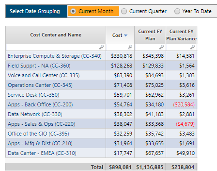
EXAMPLE 6 (BEFORE)
EXAMPLE 6 (AFTER)
Replace the time picker with additional columns, showing all three time options side by side.
We've increased at-a-glance context by being able to instantly compare current month, current quarter, and year to date.

FULL REPORT (BEFORE)

FULL REPORT (AFTER)
The overall visual layout allows us to rapidly glance back and forth between KPIs, summary charts, and the fully detailed table. This empowers us to quickly draw conclusions, notice trends, and identify potential points to explore further (by interacting with the details table).
