Using HTML to produce custom charts
Do you want a Gauge on your report? Something like this?

While it's always better to use out-of-the-box components to save time, effort, and to prevent unexpected outputs, sometimes it's necessary to build your own. You can use Scalable Vector Graphics in HTML to create a gauge like the one pictured above, since R12 has no built-in gauge component.
The first challenge is to create the pointer (or needle). For any given angle and as the length of the line is fixed, you can calculate the length of the opposite and adjacent sides of its resultant right angled triangle. To achieve this you need to use Sin() and Cos() functions which do not exist in Apptio. Rather than try to work out the mathematics to generate the values for these functions it is simpler to use the Excel spreadsheet attached at the bottom of this document. (The spreadsheet was initially intended as a lookup table to import results to Apptio, with columns handling the mathematics for Sin and Cos functions. It was extended to simplify the work in Apptio and to support a pointer with an arrowhead.)
In this example, the HTML is broken up into two parts for clarity: the pointer and the background. Note that you could combine it into a single HTML component if that works better for you.
Upload the Pointer Lookup Spreadsheet
- First, download the Pointer Lookup spreadsheet from the bottom of this article.
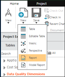
- Next, In TBM Studio, click New, then click Table.

- Then, name the table according to the following image, and click OK.

- Click File Upload.

- Select the Pointer Lookup spreadsheet.

NOTE: This spreadsheet can be altered to change the shape of the arrow if required. The spreadsheet also gives you the degree values, the values for the five points of the pointer, and Cos() and Sin() values (which are not used for this exercise, but are useful if you want to do other angular mathematics).
Create the pointer
- Next, create a Table called My KPI TA.

In your dataset that contains the KPI, you will need to convert your KPI value into a 0 – 100 % output. To convert the KPI value to a percentage, divide it by its maximum possible value and then multiply it by 100. Then, use the Round() function to convert the result into a whole number. For this example, you will use a dataset called My KPI with a single Column Called MyKPI Value. Create this in Excel and upload this into your table.

- Add a formula Step by clicking the plus icon inside the triangle. Then, click Formulas.


- In the following formula, you assume that the maximum possible value for the MyKPI Value is 100:
KPI Percent =Round(MyKPI Value / 100 ) * 100,0)
NOTE: In this example, you are using a half-moon type gauge with five divisions, but there are numerous options you can pick for the background. If you imagine the degrees on the pointer as a clock face, a pointer indicating 100% will be at 3 o'clock (0 degrees). The pointer will be at 9 o’clock to indicate 0% (-180 degrees). For 50%, the value is -90 degrees, etc. The formula for this conversion is as follows. - Add the following columns
Pointer Angle =(KPI Percent * 1.8 ) -180
Polyline =lookup(Pointer Angle,Pointer Lookup,Deg,Path)
You should end up with the following:

In your project when you are creating the dataset for the HTML to use, it is better to reduce this down to a single row, as having more than one row risks returning {Various}. - Create a new table from the existing KPI Table and filter out the rows you don’t want so that it just contains a single row with the desired KPI value.
- Right click on the Table Step and select Create new table from this step.

- Then, click Model to add a model step to the new table.

- Click the Black rectangle My KPI TA (grey below, but will be black in your project).

- This dataset will need to have a model step with an object ID that makes sense. For this example, you will use Polyline.

- Click the Close button at the bottom.
Create the HTML Box
- Now, create a report.
- Remove the table on the report and you should be left with a blank report.

- Next, click HTML on the ribbon to add an HTML component to the page.

- Don’t fill out the HTML text at this time; you will do this later. Click OK.

- In the drop-down, select My KPI TA.

- Next, expand out the My KPI TA modeled table by clicking the triangle. Drag Polyline into the Rows section.

- Select the HTML Tab and click Edit Content.

- Paste in the following HTML:
<svg viewBox="0 0 2260 2260" class="chart">
<polygon fill="black" stroke="black" stroke-width="30"
points="<%=My KPI TA.Polyline%>" />
</svg> - You should see something like this:

If you do not see the arrow, then something is not right. Ensure that you have followed the preceding steps accurately.
NOTE: These graphics are scalable—drag the side of the box to see the size of the pointer change.
Create the background
The final step is to create the background. The following HTML creates a set of curved paths for each slice, as well as adding text to each slice.
- Create another HTML Box as you did the first HTML Box (this one will be static, so you don't need any objects or columns) and enter the following:
<svg viewBox="0 0 240 200" class="chart">
<path d="M22,120 A100,100 0 0,1 39,64" style="stroke: #00a000; stroke-width:38; fill:none;"/>
<path d="M39,64 A100,100 0 0,1 89,25" style="stroke: #0050ff; stroke-width:38; fill:none;"/>
<path d="M88,25 A100,100 0 0,1 152,25" style="stroke: #fefe00; stroke-width:38; fill:none;"/>
<path d="M151,25 A100,100 0 0,1 201,64" style="stroke: #f0a510; stroke-width:38; fill:none;"/>
<path d="M201,64 A100,100 0 0,1 218,120" style="stroke: #ef0000; stroke-width:38; fill:none;"/>
<text fill="#000000" font-size="10" font-family="Verdana" x="16" y="96">Low</text>
<text fill="#ffffff" font-size="10" font-family="Verdana" x="38" y="46">Aware</text>
<text fill="#000000" font-size="10" font-family="Verdana" x="100" y="26">Medium</text>
<text fill="#000000" font-size="10" font-family="Verdana" x="172" y="46">High</text>
<text fill="#ffffff" font-size="10" font-family="Verdana" x="197" y="96">Severe</text>
</svg> - Next, you will need to drag the two HTML Boxes to the size that you want and position the pointer in the middle of the gauge. You should end up with the following result.

Remember, this is an HTML component and therefore it does have the same limitations as dynamic text in the HTML component.
There are a lot of reference articles on the Internet about HTML SVG, so you can use this function and the HTML component to create more involved graphics for your reports.