Hi @Andy Liang and @Varad Rajeev Muthal, thank you for the response. I can definitely suggest this option as this would be the best alternative at the moment.
However, there are two issues here.
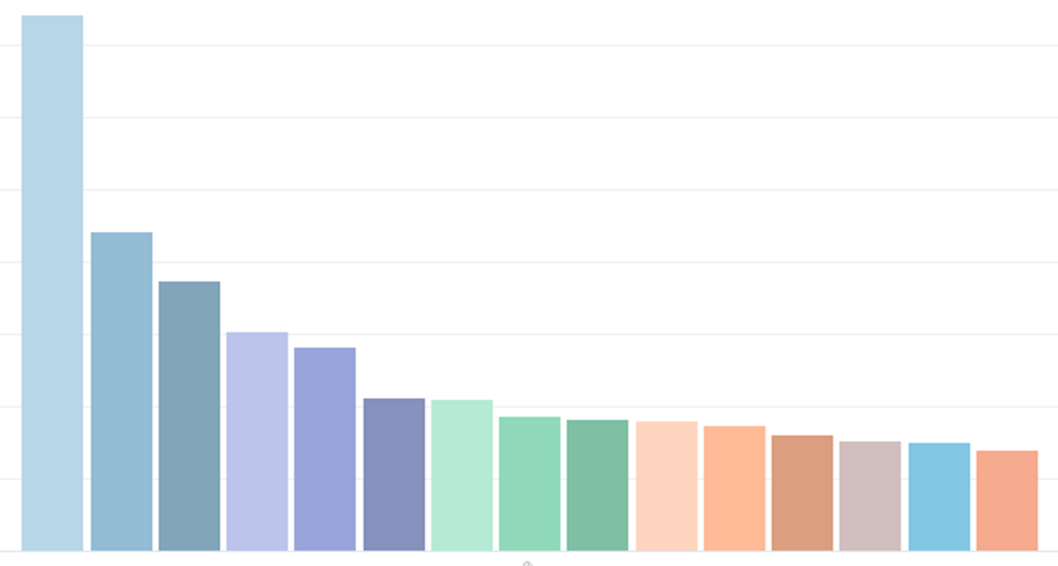
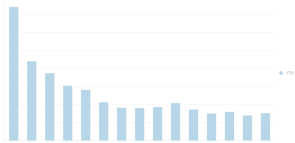
1. The sorting is not working - This is a deal breaker!
Pic 1 shows sorted values when we use the Time component, the Pic 2 shows incorrect sorting when we use the YTD function.
I feel this is happening because the sorting is done on monthly values and the columns display YTD values.
Is there a way to sort the graph based on YTD values?
2. All the bars show the same color, refer Pic 2 below (not a deal breaker but still important). Can we have different colors like the one shown in Pic 1 below.
Pic 1 -
Pic 2 -
#TBMStudio