Platform

Platform

A place for Apptio product users to learn, connect, share and grow together.

 View Only
  • 1.  Side by Side Stacked Bar Charts

    Posted Tue November 07, 2017 01:09 PM

    Is it possible in an overlay chart to have two stacked bar charts side by side rather than all on top of each other?

    I want the bars like this:


    But right now it looks like this in Apptio:


    Thanks!


    #TBMStudio


  • 2.  Re: Side by Side Stacked Bar Charts

    Posted Wed November 08, 2017 06:57 AM

    Hi Molly, 


    How have you got your table set up? I've done a normal stacked Column chart (not an overlay) with Cost and Budget in the Values, Months in the Axis and Account in the Legend and it puts Cost and Budget next to each other, with the values for each account stacked for each one. Maybe try putting the Misc/Project/Asset field in the Legend box and Cost and Budget in the same Value box and see what happens


    Oli


    #TBMStudio


  • 3.  Re: Side by Side Stacked Bar Charts

    Posted Wed November 08, 2017 07:42 AM

    Hi Oli,


    Thanks for the input!  That does seem to work, but I do have two additional questions....

    This is what it looks like now:


    1.  How do I clean up the X Axis? It's so messy/hard to read.

    2.  Can I change the shorter stacked columns to be a different color scheme?  


    Thanks!


    #TBMStudio


  • 4.  Re: Side by Side Stacked Bar Charts

    Posted Wed November 08, 2017 08:06 AM

    1. The only thing I can find to clean up the Axis is to go into the properties and tick the 'Hide X Axis' option, this just means that you have to hover on a bar to find out what month it's referring to so could get a bit annoying. 


    2. I'm not sure how this could be done  I tried putting something like Asset Cost=Blue in the colour scheme bit but it didn't work  Looks like you can only do it for Asset as a whole, not split between Cost and Budget (or not that I can see anyway)


    #TBMStudio


  • 5.  Re: Side by Side Stacked Bar Charts

    Posted Wed November 08, 2017 08:08 AM

    Drats!  I'll keep looking for something.  Thank you for your help!


    #TBMStudio


  • 6.  Re: Side by Side Stacked Bar Charts

    Posted Thu November 09, 2017 03:25 PM

    @Debbie Hagen , Any chance you might know how to help with this dilemma I'm having in reporting v12?


    Thanks!


    #TBMStudio


  • 7.  Re: Side by Side Stacked Bar Charts

    Posted Fri November 10, 2017 03:17 PM

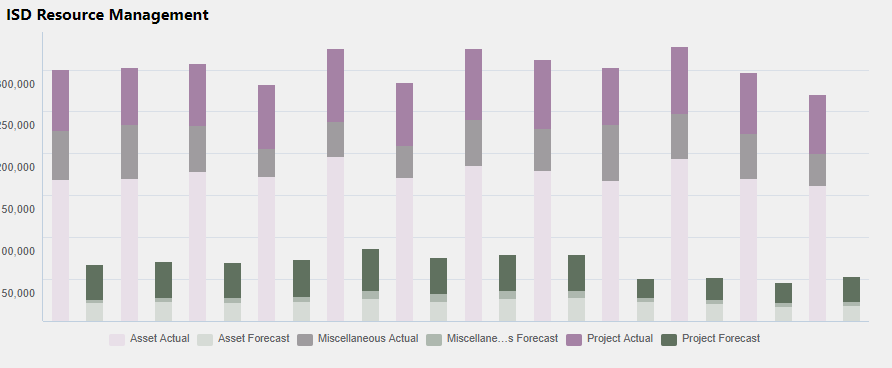
    Update - I was able to get multiple colors for the two different stacks by differentiating my legend within my data set.  I have to create another column that made forecast hours lines have an entity named Project Forecast, Asset Forecast, Misc Forecast and actual hours lines have an entity named Project Actual, Asset Actual, Misc Actual.  That way they were truly different legends:


    Had to hide my x axis still though since those titles were just plain awful looking! 


    Still looking for help on how to have the months labeled without it looking like a disaster!


    Thanks all!


    #TBMStudio


  • 8.  Re: Side by Side Stacked Bar Charts

    Posted Mon November 13, 2017 04:24 AM

    Looking good! Would be nice to be able to specify a spectrum of colours to use for Actuals and a separate one for Budget to get around this but not sure how it would be done


    #TBMStudio