Matt,
This has to do with consolidation that RRDtool does over time. By default, in RTM, and in the old 0.8.8 version of Cacti that we based RTM off of, you get 4 aggregation levels. They are:
- 5 Minutes for 2 Days,
- 30 Minutes for 2 Weeks,
- 2 Hours for 2 Months,
- 1 Day for 2 Years.
Inside of the RRDfile, as you insert data, there is a consolidation that goes on. So, every 5 minutes, as you write data into the RRDfile, on the 6th entry (5 * 6 = 30 minutes), the following is then inserted into the 30 Minute RRA (Round Robin Archive) - Max, Min, Average, and Last, this process repeats itself into the 2 Hour and 1 Day RRA's throughout the life of the Data.
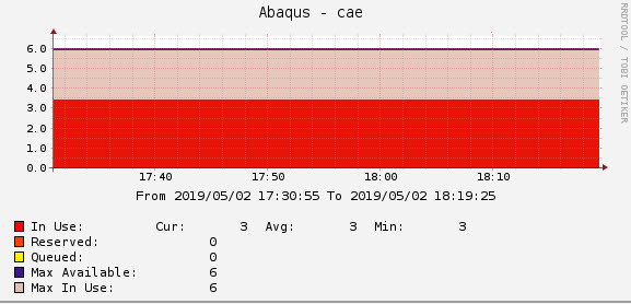
So, when you zoom beyond a 2 day window, you will start to see the Max value separate from the Average value, as you have moved into the next RRA where we tracked the peak usage over the period, but discarded the actual data that we observed.
So, this explains what is going on. Now, from a readers perspective, when you see the max value at equal to the total value, we know that we maxed out the usage for the License features, and the closer the Average is to the Max, the longer that feature was maxed out for the day.
Does it make more sense now? If you want change RTM to have longer retention's, it's always easier to do that at install time, and unless you've had prior training in Cacti and RRDtool, since most customers do not buy with consulting services to have this discussion, most people simply stick with the defaults.
Moving to a new sampling frequency (Poller Interval) will become more strait forward after the release of RTM 10.2 later this year. So, if you want to change, you can do it then. But keep in mind, without either knowing how to migrate the data, buying consulting services to help you migrate, or starting over with fresh data, you will be stuck on the 5 minute sampling frequency at that release.
I hope this helped.
------------------------------
Larry Adams
------------------------------
Original Message:
Sent: Thu June 20, 2019 05:18 AM
From: Matt McNally
Subject: RTM Understanding license feature usage.
I've modfied graph, as suggested. 
It still confuses me that the "Max In Use" is 6, yet "In Use" is 3.
------------------------------
Matt McNally
Original Message:
Sent: Wed June 19, 2019 09:27 AM
From: Larry Adams
Subject: RTM Understanding license feature usage.
Matt,
It's hard to see, but the Max Line is right over the Max Available line. So, that looks accurate. To get a better look, you can change the Max In use to an Area Fill, but make sure you add an opacity value so you can see through it to see the "In Use" value.
Larry
------------------------------
Larry Adams
Original Message:
Sent: Tue June 11, 2019 04:16 AM
From: Matt McNally
Subject: RTM Understanding license feature usage.
Hi,
Just trying to understand RTM for a license feature, see attched graph.
How is it possible that "In Use" is 3 and avg of 3, min of 3. That the "Max in Use" is 6.
Nowhere on the graph of the last 6 months do we see "In Use" to be 6, confused as to how "Max in Use", gets to 6.
If anyone can explain it would be much appreciated.
Many thanks in advance,
------------------------------
Matt McNally
------------------------------
#SpectrumComputingGroup