Hi Marloes, thank you for your question.
I am sure others will chime in, but I wanted to share that there are similar D3 custom visualizations you can download and use in Cognos Analytics in
the IBM Accelerator CatalogThe two examples (Gas Gauge, Liquid Fill Gauge) are not exactly what you are looking for, but hopefully they are a good starting point if no one else has one pre-made and you're not available to customize one for yourself. If you are interested in learning how to create a D3 custom visualization you can use in Cognos Analytics, I'd recommend checking out
this video
Hope this helps
------------------------------
Brennan Fox
Product Quality @ IBM Cognos Analytics
------------------------------
Original Message:
Sent: Wed December 02, 2020 04:31 AM
From: Marloes Corner
Subject: (Custom) Visual KPI Circle gauge
Hi!
I'm looking for a (custom) visual to show the percentage of a KPI index in different colors, like the one which can be imported in PowerBi: Circle KPI Gauge
Does anyone know if it is possible te convert a PowerBi visual to a Cognos Custom Visual or has anyone made it already?
| Circle KPI Gauge |
remove preview |
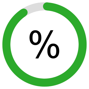 |
| Circle KPI Gauge |
| Each KPI can be visualized as donut chart. The visual is used to represent the percentage of data. It consists of an outer ring and an inner ring. |
| View this on Circle KPI Gauge > |
|
|
------------------------------
Marloes
------------------------------
#CognosAnalyticswithWatson