The United States Data Center Energy Usage Report by Berkeley Lab reports that data centers consume large amounts of electricity and they would benefit from energy-efficient improvements. Thus, how can the efficiency of energy use in data centers be improved by using analysis?
Spatio-Temporal Prediction (STP) algorithm from IBM SPSS can provide some decision support information for data center energy management systems to balance the need of operating the information technology (IT) equipment within acceptable standards, while avoiding excessive use of energy for cooling or humidification.
STP is an algorithm that is developed by IBM SPSS to solve spatio-temporal business problems, which focus on discovering useful patterns and generating estimations from spatial and temporal data sets and requires explicit modeling of spatial, temporal auto correlation and constraints.
The following use case explains by using the STP algorithm to help in managing energy used by a data center.
Example Background
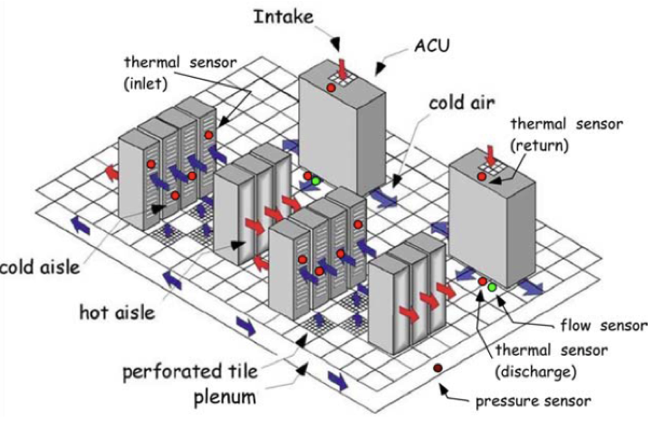
Data centers primarily contain electronic equipment that is used for data processing (servers), data storage (storage equipment), and communications (network equipment). Collectively, this equipment processes, stores, and transmits digital information. Data centers also usually contain specialized power conversion and backup equipment to maintain reliable, high-quality power as well as environmental control equipment to maintain the proper temperature and humidity for the IT equipment.
In a typical data center, the plenum supplies “cold” air through perforated tiles into the data center. The cold air cools the servers through the inlet. The heated air come out from the exhaust of the server and then returns to ACU. In ACU, air is being cooled and discharged again into the plenum. In order to better manage the energy usage of data centers, real-time thermal sensors are deployed to monitor data center. However, we don’t have sensors everywhere, so predictions need to be made for locations that have no sensor measurements. We build spatio-temporal prediction models to predict the temperature of the entire center in the future. In addition, by relating temperature to physical and other factors, such as ACU cooling impact, air flow, vertical effect to performing what-if analysis.
Solution in IBM Watson Studio
STP is integrated with IBM Watson Studio and IBM SPSS Modeler 18. The following sections describe how STP can be used by Spark 2.1 with Python 2.x in IBM Watson Studio that uses the data that is collected by sensors from a data center.
In IBM Watson Studio, we need to create a notebook for code implementation as below.
Read Data
In Watson Studio, upload your data by browsing file from your computer, then click “Insert to code” below the file that is uploaded and you can find “Insert SparkSession Dataframe”.
After clicking it, the following code to read data is generated. The variable “model_DF” is the data frame that is loaded by Spark from the original data.
import ibmos2spark
credentials = {
'auth_url': 'https://identity.open.softlayer.com',
'project_id': '801b0d319e024df1a04a94f5f8c01051',
'region': 'dallas',
'user_id': '4bb08c5db8c44f91a6a60a18f806c954',
'username': 'member_ea72cca23357bdc4bdd6e23021f513c7de69dc9a',
'password': 'D}}gLxS5.7N
}
configuration_name = 'os_c51d545cb5eb4ff1be70661fd0d5bdc6_configs'
bmos = ibmos2spark.bluemix(sc, credentials, configuration_name)
from pyspark.sql import SparkSession
spark = SparkSession.builder.getOrCreate()
model_DF = spark.read.format("com.databricks.spark.csv")\
.option("header", "true")\
.option("inferSchema", "true")\
.load(bmos.url('STP', 'DC_originalData_split_model.csv'))
model_DF.show(5)
After reading the data, we can see that the data satisfied the condition of STP usage, which contains space dimension, time dimension, predictors (input fields for prediction), and a target field as below.
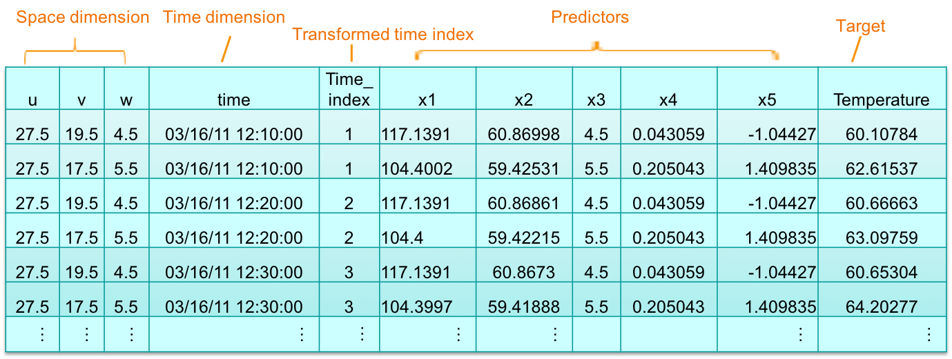
- Space dimension: ‘u’, ‘v’, ‘w’ are coordinates at locations of thermal sensors in data center. ‘w’ is height dimension in vertical and also as predictor(‘x3’).
- Time dimension: time is actual time for measurements are taken by sensors. time.index is transformed by time, which is actual input for STP.
- Predictors: ‘x1’, ‘x2’, ‘x3’, ‘x4’ and ‘x5’ are predictors. ‘x1’, ‘x2’ and ‘x3’ represents air flow, ACU impact, heights. Air flow computed from physical model and impact of each ACUs collected from knowledge base. ’x4’ and ‘x5’ are other factors.
- Target: Temperature is measured by real-time thermal sensors, which is regarded as a target.
Using STP to catch the Spatio-Temporal pattern
In STP modeling, we set the target, input the field list (predictors), location field list (space dimension), and time index (time dimension) from the loaded data above. Generally, the default settings are used if there are no specific requirements. If you want more information about the STP settings, see IBM Knowledge Center.
from pyspark.sql.types import *
from spss.ml.common.wrapper import LocalContainerManager
from spss.ml.spatiotemporal.spatiotemporalprediction import SpatioTemporalPrediction, SpatioTemporalPredictionModel
model_estimator = SpatioTemporalPrediction().\
setTargetField("Temperature").\
setInputFieldList(["x1","x2","x3","x4","x5"]).\
setLocationFieldList(["u","v","w"]).\
setTimeIndexField("time_index").\
setIntercept(True).\
setSpatialCovarianceMatrixMethod("VARIOGRAM_BASED").\
setArLag(1).\
setVariogramModelOrder(2.0)
stp_model = model_estimator.fit(model_DF)
cons = stp_model.containerSeq()
stpxml = cons.entryStringContent("STPXML.xml").encode('utf-8')
statxml = cons.entryStringContent("StatXML.xml").encode('utf-8')
from lxml import etree
print etree.tostring(etree.fromstring(stpxml), pretty_print=True)
print etree.tostring(etree.fromstring(statxml), pretty_print=True)
The STPXML.xml and the StatXML.xml are the output after the STP model is built. The former is for prediction usage, and the StatXML.xml outputs the statistics of STP model. We output the significance of each predictor and R square from StatXML to analyze this model below.
<ParameterEstimates parameterSource="regressionCoefficients">
    <ParameterStats paramName="P0000001" paramLabel="Intercept" estimate="0.2656316174657039" stdError="0.13089680527712316" sig="0.042428617893814025" tTest="2.029320860072422" df="88162.0" confIntervalLower="0.009075152443470236" confIntervalUpper="0.5221880824879376">
        <RegressionParameter isIntercept="true"/>
    </ParameterStats>
    <ParameterStats paramName="P0000002" paramLabel="x1" estimate="-0.052151062525609256" stdError="2.023283243624003E-4" sig="0.0" tTest="-257.7546306971776" df="88162.0" confIntervalLower="-0.05254762407317638" confIntervalUpper="-0.05175450097804213">
        <Statistic name="fixedEffectIndex" value="0"/>
        <RegressionParameter>
            <Covariate field="x1" power="1"/>
        </RegressionParameter>
    </ParameterStats>
    <ParameterStats paramName="P0000003" paramLabel="x2" estimate="0.8834761253950119" stdError="0.0020601930648772395" sig="0.0" tTest="428.83171507407025" df="88162.0" confIntervalLower="0.8794381670287308" confIntervalUpper="0.8875140837612929">
        <Statistic name="fixedEffectIndex" value="1"/>
        <RegressionParameter>
            <Covariate field="x2" power="1"/>
        </RegressionParameter>
    </ParameterStats>
    <ParameterStats paramName="P0000004" paramLabel="x3" estimate="2.913737358763535" stdError="0.003509988777260587" sig="0.0" tTest="830.1272578533988" df="88162.0" confIntervalLower="2.906857814904117" confIntervalUpper="2.920616902622953">
        <Statistic name="fixedEffectIndex" value="2"/>
        <RegressionParameter>
            <Covariate field="x3" power="1"/>
        </RegressionParameter>
    </ParameterStats>
    <ParameterStats paramName="P0000005" paramLabel="x4" estimate="0.008131100771915981" stdError="0.004469037094006054" sig="0.06884922250931558" tTest="1.819430136935213" df="88162.0" confIntervalLower="-6.28168459017751E-4" confIntervalUpper="0.016890370002849715">
        <Statistic name="fixedEffectIndex" value="3"/>
        <RegressionParameter>
            <Covariate field="x4" power="1"/>
        </RegressionParameter>
    </ParameterStats>
    <ParameterStats paramName="P0000006" paramLabel="x5" estimate="0.002972055753039868" stdError="0.004302951684746584" sig="0.48975488164535674" tTest="0.6907016324574191" df="88162.0" confIntervalLower="-0.005461687691369357" confIntervalUpper="0.011405799197449093">
        <Statistic name="fixedEffectIndex" value="4"/>
        <RegressionParameter>
            <Covariate field="x5" power="1"/>
        </RegressionParameter>
    </ParameterStats>
</ParameterEstimates>
From the model information in the above StatXML fragment, the value of 'sig' attribute for x1, x2, and x3 are 0.0, which is less than 0.05. That indicates that the three factors: the air flow, ACU impact, and sensor height are very important for temperature changes. Therefore, if temperature in the next few minutes needs to be changed, it can be achieved by adjusting these factors. The parameters x4 and x5, with a significance value of more than 0.05, are not important parameters for temperature.
<Statistic name="RSquare" value="0.9680580670366467"/>
To evaluate the model, the R square definition in regression can be borrowed to show the model’s goodness of fit. In regression, the R square coefficient of determination is a statistical measure of how well the regression predictions approximate the real data points. R square summarizes the proportion of variance in the dependent variable that is associated with the predictor (independent) variables, with larger R square values indicating that more of the variation is explained by the model, to a maximum of 1. Here the R square value is 0.9680580670366467, close to 1, and indicates that the model fitting effect is very good.
Knowing what will happen with STP Prediction
Below the code shows how we can do the prediction.
score_DF = spark.read.format("com.databricks.spark.csv")\
.option("header", "true")\
.option("inferSchema", "true")\
.load(bmos.url('STP', 'DC_originalData_split_score.csv'))
score_DF.show(5)
stp_fit = stp_model.setFutureTimeSteps(144).transform(score_DF)
stp_fit.show(5)
score_DF1 = spark.read.format("com.databricks.spark.csv")\
.option("header", "true")\
.option("inferSchema", "true")\
.load(bmos.url('STP', 'stp_demo4Dc_score_moreLocations.csv'))
score_DF1.show(5)
stp_prediction = stp_model.transform(score_DF1)
stp_prediction.show(5)
After the prediction, there are four more fields added. See the following table:
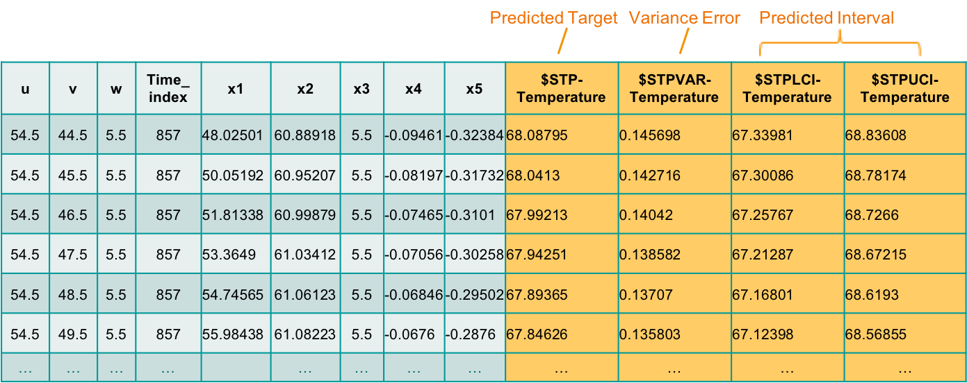
- Predicted target ($STP-Temperature) - is the temperature prediction at one location and one future certain time in the data center.
- Variance error ($STPVAR-Temperature) - shows the error value of the predicted temperature.
- Predicted Interval ($STPLCI-Temperature and $STPUCI-Temperature) – is the range for the predicted temperature, indicates that the predicted temperature has a probability of 95% chance of falling within the confidence interval between $STPLCI-Temperature and $STPUCI-Temperature.
Visualization for Prediction Results
According to the space and time dimensions in data, the results of STP prediction can be visualized by Python Matplotlib at different angles.
Visualization at one location over time
We can plot the temperature trend at the same location in the future at consecutive moments. Here the observed data is split to model part and score part to get predicted results by STP, then plot the observed temperature line and predicted temperature line for fitting.
from pyspark.sql.types import *
import matplotlib.pyplot as plt
import pandas as pd
plt.figure(figsize=(10,6))
model_DF_1loc = model_DF.where((model_DF.u == 27.5) & (model_DF.v == 19.5) & (model_DF.w == 4.5))
model_DF_1loc = model_DF_1loc.toPandas()
x0 = pd.to_datetime(model_DF_1loc.time)
y0 = model_DF_1loc.Temperature
stp_fit_1loc = stp_fit.where((stp_fit.u == 27.5) & (stp_fit.v == 19.5) & (stp_fit.w == 4.5)).withColumnRenamed("$STP-Temperature", "predict_Temperature").withColumnRenamed("$STPLCI-Temperature", "LCI_Temperature").withColumnRenamed("$STPUCI-Temperature", "UCI_Temperature")
stp_fit_1loc = stp_fit_1loc.toPandas()
x1 = pd.to_datetime(stp_fit_1loc.time)
y0_1 = stp_fit_1loc.Temperature
y1 = stp_fit_1loc.predict_Temperature
lci = stp_fit_1loc.LCI_Temperature
uci = stp_fit_1loc.UCI_Temperature
lines = plt.plot(x0, y0, x1, y0_1, x1, y1, x1, lci, x1, uci, marker='None')
plt.setp(lines[0], color='gray')
plt.setp(lines[1], color='gray')
plt.setp(lines[2], linewidth=4, color='m')
plt.setp(lines[3], linewidth=2, color='c')
plt.setp(lines[4], linewidth=2, color='c')
plt.legend([lines[0], lines[2], lines[3], lines[4]], ['Observed Temperature', 'Predicted Temperature', 'LCI', 'UCI'],loc='upper right',fontsize=8)
plt.xlabel("Time")
plt.ylabel("Temperature")
plt.title("Prediction over Time")
plt.show()
 From the chart, you can see that the trend of predicted temperature is consistent with the actual observed temperature change. LCI and UCI also accurately show the range of temperature fluctuations.
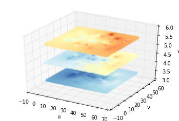
Visualization with multiple locations at a certain time
We can also draw the temperature distribution in space at a certain time as below.
import matplotlib.pyplot as plt
from mpl_toolkits.mplot3d import Axes3D
model_DF_1time = model_DF.where(model_DF.time_index == 856)
u = model_DF_1time.select("u").collect()
v = model_DF_1time.select("v").collect()
w = model_DF_1time.select("w").collect()
y = model_DF_1time.select("Temperature").collect()
fig = plt.figure()
cx = fig.add_subplot(111, projection='3d')
cx.scatter(u,v,w,c=y,cmap='RdYlBu_r',vmin=57,vmax=73,s=50,edgecolors='none',marker='o')
cx.set_xlabel('u')
cx.set_ylabel('v')
cx.set_zlabel('w')
plt.show()

Observed temperature distribution at one time
fig2 = plt.figure()
predict_3Layers = stp_prediction.where(((stp_prediction.w == 3.5) | (stp_prediction.w == 4.5) | (stp_prediction.w == 5.5)) & (stp_prediction.time_index==857))
u2 = predict_3Layers.select("u").collect()
v2 = predict_3Layers.select("v").collect()
w2 = predict_3Layers.select("w").collect()
y2 = predict_3Layers.select("$STP-Temperature").collect()
bx = fig2.add_subplot(111, projection='3d')
bx.scatter(u2,v2,w2,c=y2,cmap='RdYlBu_r',vmin=57,vmax=73,s=20,edgecolors='none',marker='s')
bx.set_xlabel('u')
bx.set_ylabel('v')
bx.set_zlabel('w')
plt.show()
Predicted temperature distribution at one time at three heights
 Predicted temperature distribution at one time in entire data center
From above figures, we know that STP can predict the future temperature at any location in the data center through the limited spatial points in the model, which is also called the “predicted anywhere” feature.
Then let's see what kind of phenomenon can be found from these heat maps. Typically, heat accumulates at high altitudes, so as the altitude rises, the temperature rises. Therefore, maintaining good ventilation at the top of the data center to dissipate heat is needed.
In the legend, the darker the color, the higher the temperature, and we can see that some local temperatures might have reached the threshold. Thus, we need to adopt some measures to lower the temperature to the appropriate range.
Decision Support with “what if analysis”
In STP modeling as mentioned before, we know that air flow, ACU impact, and sensor height are the main factors affecting temperature changes. Then, we can adjust the device parameters that affect these factors to achieve the expected temperature.
This is another feature of STP called “what if analysis,” where we can assume that these parameters predict temperature changes in the future. The predictions continue until the adjusted parameters are ideal enough to help make decisions on equipment operation.
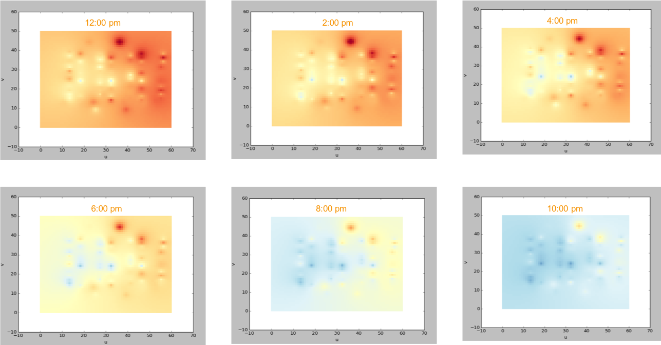
For example, after adjusting the air volume and temperature of the device near the positions where the temperature is too high, the length of time it takes for the temperature to gradually drop to the expected goal is predicted. The figure below shows the changes of the two-dimensional temperature heat map in the next few moments at the height of 5.5 after adjusting the equipment parameters.
In this solution for data center energy management, STP can predict temperature values anywhere in the space and guides the user through adjusting the device parameters to regulate the temperature within the appropriate range. As such, the power usage of the data center will become energy-efficient. In addition, STP can also model and predict by using humidity as a target. Thus, STP has the capability of helping data centers create smarter energy management systems.
Summary
Beside energy management in data center, STP has many potential applications such as performance analysis and forecasting for mechanical service engineers, or public transport planning. STP supports two-dimensional or three-dimensional locations, so that it can be adapted to a wide variety of spatial systems.
#GlobalAIandDataScience#GlobalDataScience