Originally posted here: https://link.medium.com/WpRenMRmJV
Most of us would agree that college admission can be a highly biased process with a general lack of transparency. What works for an applicant one year might not work at all a year later. In itself, that is not surprising. A university’s needs can change from year to year. One year, they might may need an amazing quarterback. The next year maybe it’s a stellar runner or star students in physics. Those needs can guide admissions committees in ways that we’ll never know. For instance, at many schools, legacies and athletes have an advantage (though it’s difficult to measure how much).
The recent news about cheating in the admissions process has undermined its credibility, to say the least. As a consequence, I decided to study college admissions in a data-driven way. Given that the admission process lacks transparency, I started by looking at SAT scores. The design of the SAT exam may not be perfect, but it does give us a consistent metric to analyze.
For the insights and visualizations in this blog, I used the Data Refinery Tool in IBM Watson Studio.
Getting the Data
I used Google’s Dataset Search, an amazing tool for tracking down data. I just searched “California SAT” and the first few results were SAT reports from different school years, the most recent of which was the California SAT report from 2015–2016, downloadable from data.world. The data set shows average scores for each school in California. (To preserve anonymity, the data set excludes scores from schools where fewer than 15 students took the exam.)
Exploring and Visualizing the Scores
SAT scores have a maximum score of 2,400 points, with scores ranging from 200 to 800 for three separate sections: Reading, Writing, and Math.
One column in the data set shows the percentage of students who scored greater or equal to 1,500 points. I decided to group those per-school percentages by county and then averaged across each county. For scores of 1500 and over, the five counties with the highest averaged percentage were:
• Nevada — 67.8%
• Amador — 65.6%
• Marin — 65.2%
• El Dorado — 62.4%
• San Mateo — 60.5%
The five counties with the lowest average percentage were:
• Merced — 21.1%
• Colusa — 23.6%
• Fresno — 24%
• Tulare — 24.9%
• Riverside — 27.4%

I decided to also look at the average total SAT score by county, in other words the sum of the average scores of the three sections (Reading, Writing, and Math) averaged by county. Since the total score ranges from 600–2,400, I divided by 2,400 and multiplied by 100 to see this metric as a percentage. Again, we see the same general pattern of highs and lows:
• Nevada — 67.3%
• Marin — 66.9%
• Santa Clara — 66.9%
• San Mateo — 66.6%
• El Dorado — 66%
…compared with …
• Merced — 54.7%
• Fresno — 54.9%
• Tulare — 55.4%
• Inyo — 55.6 %
• Riverside — 55.8%

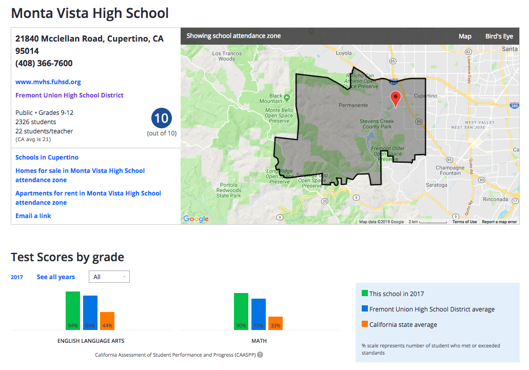
I found that the highest average total scores came from Santa Clara County: 85.3%. That’s an average of 2,043 out of 2,400 points. And within Santa Clara County, the top scores came from Monta Vista High in the Fremont Union High school district. I was able to validate the accuracy of the results using Zillow, which provides a generous amount of well-organized school information. Not surprisingly, Zillow ranks Monta Vista High as 10 out of 10. (I’m showing results for 2017, but in the Zillow app you can see results for the last 3 years.)
In a follow-up post, I’ll explore the correlations to property price data per school or district. I suspect there’s a strong one.
Correlations Between SAT Sections (Reading, Writing and Math)
I suspected that students with high scores on the Math section would tend to score less well on Reading and Writing. I was able to explore this idea by computing the linear correlations between the Reading, Writing, and Math exams. I was wrong. In fact, the linear correlations between the pairs (Math, Reading) and (Math, Writing) are both fairly strong as you can see in the following plot. I wonder if these strong correlations hold for GRE scores too, where a greater percentage of test-takers are non-native English speakers.

With very little public data, decoding college admissions is hard. As a proxy, I looked at SAT scores in California from 2015–1016 to explore its distribution by county, district and school. I also observed that correlations between the different sections of the SAT scores are strong. In other words, students that do well on one section tend to do well on other sections. For a second pass of this exploration, I’m excited to bring in county property costs and school levels to see how they relate to SAT scores.
For this analysis, I used IBM’s Watson Studio Desktop, which makes interacting visually with the data easy and fast.
Special thanks to Steve Moore for his great feedback on this post.
Jorge Castañón, Ph.D.
Senior Data Scientist @ Machine Learning Hub
--
#GlobalAIandDataScience#GlobalDataScience