Charting was drastically updated as a major feature in
SPSS Statistics 25 and Subscription, but we've maintained the ability to create black and charts for publication purposes. There are two easy ways to do this.
[caption id="attachment_7307" align="alignnone" width="1334"]

Option 1) Publication Gray template shipped with SPSS Statistics[/caption]
First option: Use the "Publication Gray" template shipped with every copy of 25 and Subscription. This file is named "PublicationGray.sgt" (search your system for the correct location for your operating system). You can easily specify this file while building the chart on the Chart Appearance tab.
[caption id="attachment_7308" align="alignnone" width="2716"]
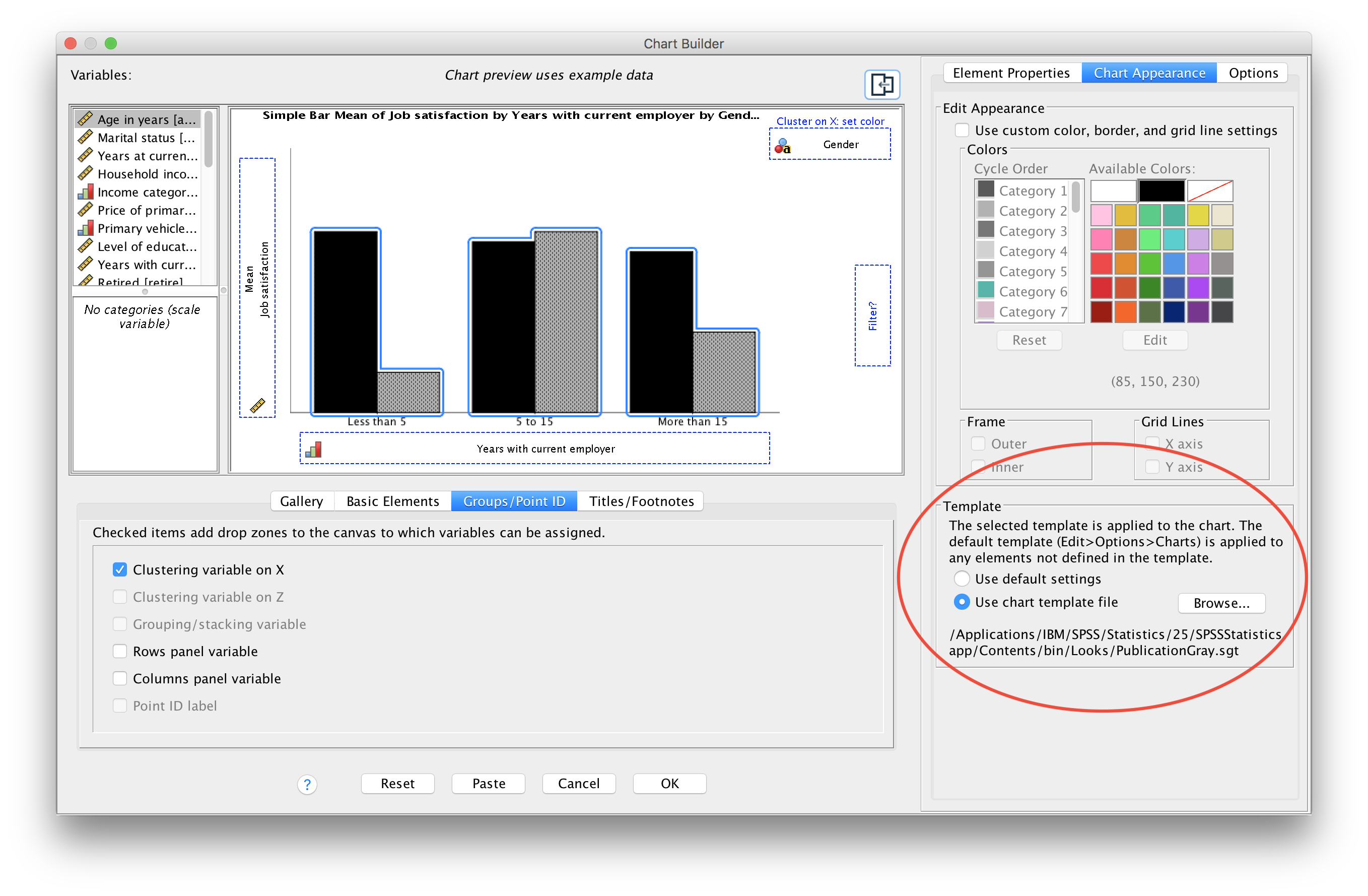
Specifying a chart template[/caption]
Second option: Use patterns instead of colors. By navigating to the overall SPSS Statistics options, you can ask SPSS to generate charts with patterns instead of colors. This option is found within the Charts tab.
[caption id="attachment_7310" align="alignnone" width="1868"]

Location in the options menu to use patterns instead of colors[/caption]
This option will default in a black and white patterned charts. If you prefer borders on all of your charts, you can use
this template to generate the below chart.
[caption id="attachment_7311" align="alignnone" width="1334"]

Option 2) A patterned chart using
border.sgt template[/caption]
Charting in SPSS Statistics is incredibly flexible, so you can edit these charts after creation to change nearly every attribute, then save a template of that chart for future use. Finally, keep in mind exporting your chart as a PDF will yield the highest quality.
#chart#datavisualization#SPSS#SPSSStatistics#statistics