Description
This document introduces the steps of how to generate useful dashboard in Kibana, based on the data collected by LSF Explorer.
Modules of Kibana
- Management
- Visualization
- Dashboard
Kibana version:7.2.1
The data collected by LSF Explore used in visualization
Fields:
|
Index
|
Fields
|
Description
|
|
lsf_job_acct
|
max_mem
|
Job maximum memory usage, in bytes
|
|
lsf_job_acct
|
resource_req.mem.min
|
Memory resource requirement string describes the memory resources a job needs
|
|
lsf_job_acct
|
cluster_name
|
LSF cluster name
|
|
lsf_job_acct
|
queue_name
|
Queue to which the job was submitted
|
|
lsf_job_acct
|
event_time
|
ISO-formatted event time in the cluster local time zone
|
|
Lsf_job_acct
|
job_id
|
LSF Job id
|
|
Lsf_job_acct
|
run_time
|
Job run time
|
* lsf_job_acct index - Information about done and exited LSF jobs (DONE, EXIT).
Type of event is JOB_FINISH
Chart 1:Memory outlier
This section will introduce how to generate a chart which shows the ratio of the actually used memory to the requested memory.
A scripted field named percentiles (mem used/mem request) will be created and its threshold will be set to 60%. When the job's percentiles are less than 60%, it is considered as memory outlier.
Assuming that the Kibana is connected to Elasticsearch, and lsb_acct index is used as the data source.
- Go to Management > Kibana > Index Patterns
- Select the index pattern(lsb_acct* index) that will be added a scripted field to
- Go to the pattern's Scripted fields
- Click Add scripted field
- Enter a name for the scripted field, for example 'percentiles'
- Enter the expression that will be used to compute a value on the fly from the index script as below
((doc['max_mem'].value==0)?0:((doc['max_mem'].value/1024)/((doc['resource_req.mem.min'].size()==0)?(doc['max_mem'].value/1024):doc['resource_req.mem.min'].value)))
This script is to get a ratio of memory usage and request memory
- Click Create field.
- Open Visualize to show the overview page
- Click Create new visualization. You'll see all the visualization types in Kibana
- Click Vertical Bar
- In Choose a source, select the lsb_acct* index pattern
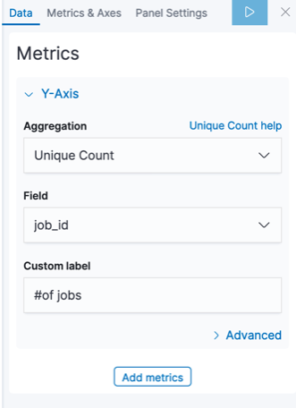
- Show the number of job id per percentile along the Y-axis
- In the Metrics pane, expand Y-axis
- Set Aggregation to Unique Count
- Set Field to job_id
- Set Custom label to '# of jobs'
- Show the percentiles along the X-axis
- In the Buckets pane, click Add>X-axis
- Set Aggregation to Range
- Set Field to percentiles which defined before as scripted field
- Set 'from' and 'to' as below
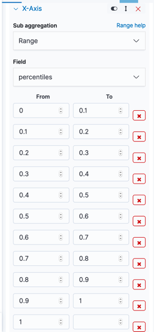
- Set custom label to 'Memory used/Memory Request'
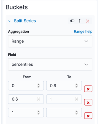
- In the buckets pane, click Add->Split Series
- Set Aggregation to Range
- Set Field to percentiles which defined before as scripted field
- Set 'from' and 'to' as below
- Click Apply changes. Then, the visualization should look like this
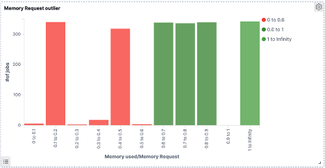
*Red stands for outlier; Green stands for OK
- Save the visualization with name 'Memory outlier'.
Chart 2:Req_mem VS Mem_used
This section will introduce how to generate a chart that the actual job memory usage comparing with the memory request.
- Click Create new visualization. You'll see all the visualization types in Kibana
- Click Vertical Bar
- In Choose a source, select the lsb_acct* index pattern
- Show Average of memory usage per event time along the Y-axis
- In the Metrics pane, expand Y-axis
- Set Aggregation to 'Average'
- Set Field to 'Max_mem'
- Set Custom label to 'Average Memory usage'
- Click Advanced and add. script '{ "script" : "doc['max_mem'].value /1024" }' as JSON input
- Click the Metrics & Axes tab
- Click Average of memory usage
- Set Chart type to 'area'
- Show Average of memory request per event time along the X-axis
- In the Metrics pane, click Add metrics and expand X-axis
- Set Aggregation to 'Average'
- Set Aggregation to 'resource_req.mem.min'
- Set Custom label to 'Average of memory request'
- Click the Metrics & Axes tab
- Click Average of memory usage
- Set Chart type to 'area'
- Show Max of memory usage per event time along the Y-axis
- In the Metrics pane, click Add metrics and expand Y-axis
- Set Aggregation to 'Max'
- Set Field to 'Max_mem'
- Set Custom label to 'Max of memory usage'.
- Click advanced and add script:{ "script" :"doc['max_mem'].value /1024" } as JSON input
- Show the event time along the X-axis
- In the Buckets pane, click Add>X-aixs
- Set Aggregation to 'Date Histogram'
- Set Field to 'event_time', and Minimum Interval to 'Auto'
- Click Apply changes. visualization should look like this
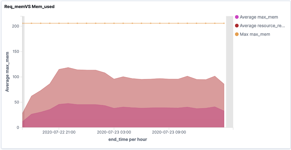
- Save the visualization with name 'Req_mem VS Mem_used'
Chart 3:Job run time rank
Statistic Number of jobs is based on run time rank.
- Go to Management > Kibana > Index Patterns
- Select the index pattern(lsb_acct* index) to add a scripted field to
- Go to the pattern's Scripted fields
- Click Add scripted field.
- Enter a name for the scripted field, for example 'percentiles'
- Enter the expression that is used to compute a value on the fly from the index script as below
if (doc['run_time'].value <=300){ return ' 0 m to 5 m ' }else if (doc['run_time'].value <=3600){ return '5m to 1 hours' }else if (doc['run_time'].value <=14400){ return '1 hours to 4 hours' }else if (doc['run_time'].value<=86400){ return '4 hours to 1 day' }else { return 'More than one day' }This script is for calculating job run time rank.
- Open Visualize to show the overview page
- Click Create new visualization. You'll see all the visualization types in Kibana
- Click Vertical Bar
- In Choose a source, select the lsb_acct* index pattern.
- Show the number of job id per percentile along the Y-axis
- In the Metrics pane, expand Y-axis.
- Set Aggregation to Unique Count
- Set Field to
- Set Custom label to '# of jobs'
- Show the job run time rank along the X-axis
- In the Buckets pane, click Add>X-axis
- Set Aggregation to Terms
- Set Field to job_runtime_rank which defined before as scripted field
- Set order by to 'metric: # Unique count of jobs'
- Click Apply changes. visualization should looks like this
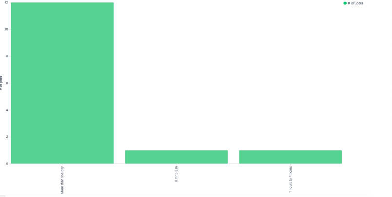
- Save the visualization with name 'Job run time rank'.
Chart 4:Summary
This section introduces how to generate a data table. This table will show the job memory usage, job memory request, memory usage/memory application, and the number of jobs completed aggregated by the cluster name and queue name.
- Click Create new visualization. All the visualization types display in Kibana.
- Click Data Table.
- In Choose a source, select the lsb_acct* index pattern.
- Add Metrics into Data table.
- In the Metrics pane, click
- Set Aggregation to 'Unique Count'
- Set Field to 'job_id'.
- Set Custom label to '# of jobs'.
- Click Add metrics and click Metric.
- Set Aggregation to 'Average'.
- Set Field to 'Max_mem'.
- Set Custom label to 'Average of memory usage'
- Click advanced and add script: { "script" :"doc['max_mem'].value /1024" } as JSON input.
- Click Add metrics and click Metric.
- Set Aggregation to 'Average'.
- Set Field to 'resource_req.mem.min'
- Set Custom label to 'Average of memory request'.
- Click Add metrics and click Metric.
- Set Field to 'percentiles'
- Set Custom label to 'Average of (memory usage/memory request)'
- Add dimensions into Data Table
- In Buckets pane, click Split Rows
- Set Aggregation to 'Terms'.
- Set Field 'cluster_name'
- Set Order by to 'Alphabetical'
- Set Custom label to 'Cluster Name'.
- Click Add sub-buckets.
- Click Split Rows
- Set Field 'queue_name'
- Set sub aggregation to 'Terms'
- Set Order by 'Alphabetical'
- Set Custom label to 'Queue Name'.
- Click Apply changes. The graph is as below
Create dashboard
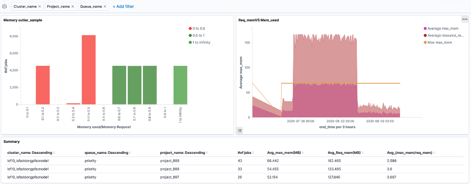
A dashboard is a collection of visualizations that can be arranged and shared. This section will create a dashboard that contains the visualizations that have been saved during above tutorial.
- Open Dashboard.
- On the Dashboard overview page, click Create new dashboard
- Set the time filter to proper time
- Click Add in the menu bar.
- Add Memory outlier, Req_mem VS Mem_used,Summary.
- Resize Summary chart. A resize control is on the lower right.
- Click Add Filter
- Set Field to 'cluster_name'.
- Set Operator to 'is one of'
- Set Value to $yourclustername
- Enable Create custom label and set a name for it
- Click Save.
- Repeat step1-5 to add projct_name and queue_name as filters
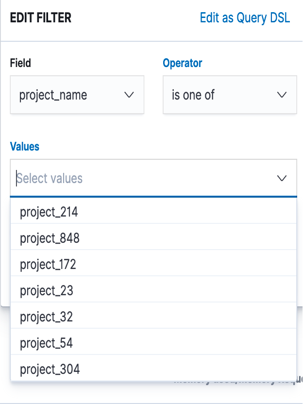 Note: By default, the Search API returns the top 10 matching documents, which is why only 10 items can be seen in the drop-down list, even though there are more. Click 'Edit as query DSL' to edit the query to make more items be listed.
The sample dashboard may look like below
------------------------------
Edward Deng
------------------------------
#SpectrumComputingGroup