Tips & Tricks
Use of Exploration vs. Single Cell on dashboards with different data types
(PA 2.0.73-74)
On this dashboard, there is not much apparent difference between the single values for Net profit and Allocation that are highlighted.
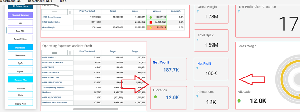
These values might all be synchronized with dashboard selectors, the numbers could be similarly formatted, and the appearance could be identically defined for text, border, and color. However, the values reside in different objects. The ones on the left are explorations, while the ones on the right are single cells. This explains why the objects and the values they contain look slightly different.
To make an exploration look just like a single cell, keep only one member, and apply the following settings:
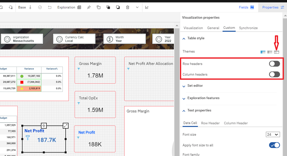
The advantage to using an exploration is that it lets you display the exploration context area to see where the value is coming from. The full source for the value in a single cell is not identifiable.
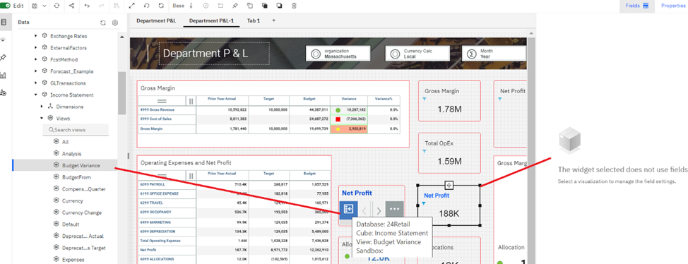
In comparison to a single cell, the only option missing in an exploration is the ability to automatically display the filter icon beside the value. As a workaround, a filter image could be added beside the exploration. Also, note that the number abbreviation is slightly different for the values:

As a dashboard creator, keep these differences in mind when making choices about how to display single numeric values.
Next, consider the display of strings in an exploration versus a single cell. Here’s an example where the same string is displayed in an exploration (on the left) and a single cell (on the right):

As you can see, the string is truncated in the exploration and initially appears in a small, difficult to read font in the single cell. You can manage each object to improve the display of text.
In the exploration, you can expand the width of the column to display additional text, as shown here:

Tip: You can hover the cursor anywhere on the cell to view the entire string in a pop-up box.
This is a bit of an improvement, but the full string is still not visible and there is a limit on how wide you can set the column width. Note that the string is displayed in a single line without any wrapping. The exploration string value display is entirely dependent on the column width; the row height doesn’t have any impact on the text display.
Conversely, the single cell provides a couple of helpful options to manage the display of text. Select the single cell while in Edit mode, then click Properties. Click the Custom tab, then expand the Text properties group. The two options to focus on are Font size and Enable auto-resizing. These options operate independent of each other.
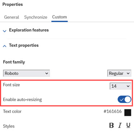
When you set a Font size, the size is applied to the text within the confines of the current cell dimensions. If the text extends beyond the bottom edge of the cell because of the new font size, a scroll bar is added to the cell to enable users to view the entire string.
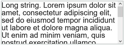
Tip: You can hover the cursor anywhere on the single cell to view the entire string in a pop-up box.
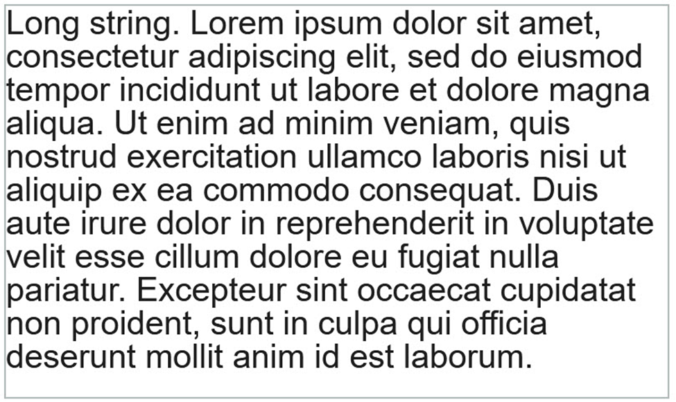
When you turn on the Enable auto-resizing option, the text in the single cell is automatically resized to fill the maximum available space within the resized single cell.
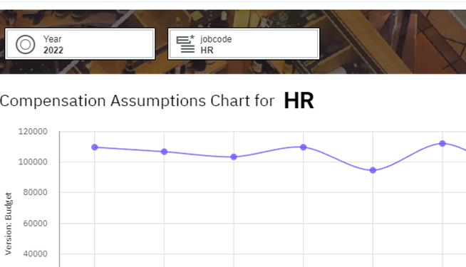
Another interesting possibility regarding the display of string values is the use of picklists. You can use picklists as dynamic titles in a dashboard:
These are just a few examples where unconventional uses of Planning Analytics objects and options can be beneficial when creating a dashboard.
#PlanningAnalyticswithWatson