This release is jammed packed full of goodies. We added some cool data exploration features like the top/bottom count, conditional formatting and crosstabs. For those who need to access data from their Framework Manager packages, we’re introducing data sets that can cache that info and use it in dashboarding. There’s also a refresh timer now on widgets to allow hands-off refresh of widgets when the data changes frequently. Check out each feature in greater detail below.
Conditional formattingWe took a feature that has been around for years and completely turned it on its head to make it more visual, more dynamic and fun to use. The traditional idea behind conditional formatting is to highlight certain data points based on predefined thresholds. We not only wanted to do that, but also wanted to use it as a way to analyze your data to see trends, groups and outliers.
Drag a measure into the color by slot of a grid or crosstab and you’ll immediately see two indicators on the visualization:
1) the values get highlighted based on the thresholds
2) a visual representation of the distribution of your data
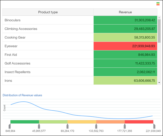
In this example, even though I can see only a small portion of all my data points, I immediately get a sense of the distribution of my values across all Products. One in particular really stands out: Eyewear.
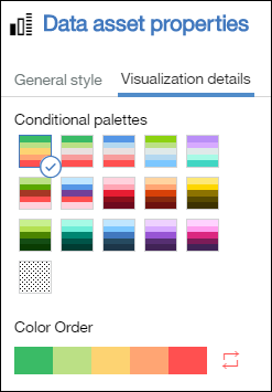
You’ll want to play with the ranges, delete a few handles and slides them around to get the right buckets. Head over to the properties to select different palettes and color order.
Once you define your thresholds, you may want to add a filter to your canvas to iterate across the values to quickly and visually compare values. Below, I added Products to my canvas to spot and regions that are either doing poorly of exceptionally well across my product lines.
 Crosstabs
Ask any data analyst what type of visualizations they use most, and many of them will say the crosstab. These users will be happy to see that we now provide the ability to define them in the dashboard. Our goal was to provide a crosstab that was both easy to use and provide the right level of functionality. Check it out and play with them, you’ll notice that we provide two levels of nesting on both edges, unlimited number of measures and display summaries on the groups.
All the expected functionality is here, swap rows and columns, format, create calculation, filter, sort, etc.
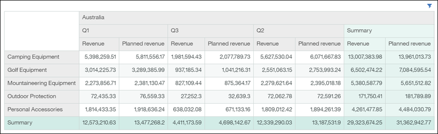
To get a better sense of how my sales are doing, I created a “Goal” calculation defined as Revenue % Planned Revenue. I then placed my new calculation as my conditional formatting and adjusted the buckets. Yikes, maybe I should take a closer look at what’s going on in my sales in Australia for Q3. I think that warrants a trip!
 Refresh widgets on a timer
One of the traditional usage of a dashboard is to monitor data, but where it gets interesting is when the data continuously changes and you need to update the visualizations without manually clicking on refresh.
We are introducing a refresh timer for all widgets. The delay can be set in seconds, minutes or hours, with a minimum of 5 seconds. Open up a widget’s properties to enable the timer, and watch your visualization automatically update based on the latest info. Of course, this is more visually interesting when the data actually changes.

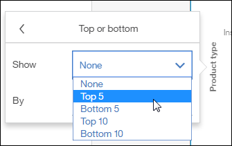
 Top / Bottom count
When I am faced with a lots of information, I very often find myself filtering down what I’m looking at to only a subset. Maybe I’m interested in only my top performing products, or maybe I want to zero in on the stores that are struggling. To facilitate this, we’re introducing the ability to filter your data on the top, bottom five or 10 on any chart. Click on the axis label to expose the new icon in the on-demand toolbar and select the new double-arrow icon for the top/bottom feature.
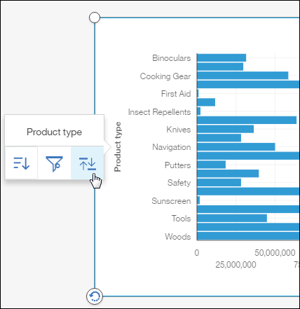
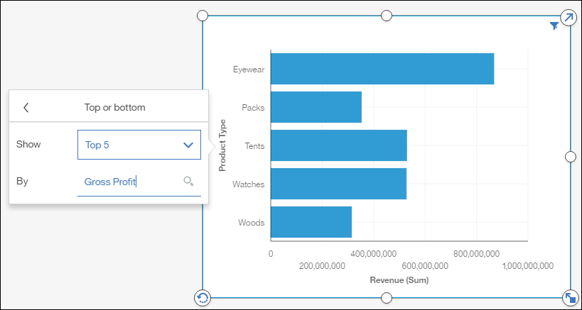
You can also select a different measure than the one that is currently being projected. In my case, I’d like to see the revenue for my top five most profitable products:
For those who prefer to see actual numbers rather than a visualization, the grid allows you to display the rank of the top/bottom filter. In the screenshot below, I’ve switched my bar chart to a grid and edited my top count. Once the grid is displayed, I can now show the rank column. This allows me to sort on another column, without losing the ranking of each row.
 Use data sets to access info from Framework Manager (FM) packages
To learn more about data sets, head over to
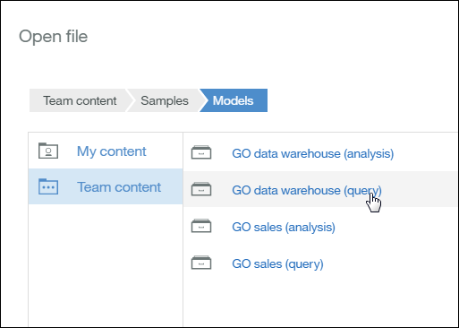
Jason’s blog post. He’s got a great article that covers what they are and how to use them. As a dashboard user, we wanted to also provide an easy way to define data sets without having to leave the dashboard. To do this, simply open the dashboard and select your FM package:
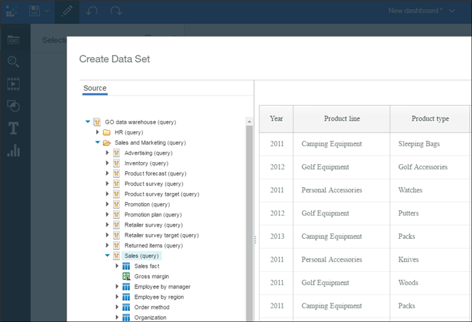
Once you’ve selected your FM package (relational or OLAP), the interface comes up that allows you to define your fields:
Once data is loaded into your data set, you can use the data in a dashboard. If you’ve forgotten a field or need to modify the data set, you can edit or refresh the data manually it via the extended menu.
 Time and geolocation fields in the dashboard
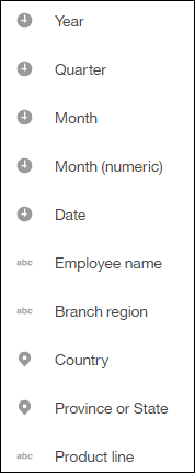
After importing a file or creating a data module in 11.0.4, you’ll notice new icons next to the names of the fields in the dashboard. Cognos Analytics now recognizes dates and geolocation fields and use these to provide a better user experience in the dashboard. Let’s walk through an example, below are my available fields, where they have been automatically defined as time and location by the system:
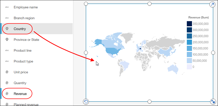
These new time and geolocation icons provide guidance to the user that these fields have additional capabilities. The user can drag and drop Country and Revenue fields to get a map automatically drawn:
Same idea with fields that are marked as time based, we now display a calendar when the user filters on that field:
 Sorting based on the values of another field
You rarely see a defect fix making the list of items in a What’s new article, but this one merits a mention. As part of a data module, a user can define a sort order of a field that is based on another field. A good example of that would be to sort the months based on a numeric field as opposed to the caption. No one wants to see April as being the first month of the year. Below is an example where I defined the sort of the Month field based on MonthID. The months show up in the expected order:
 Related post: Video: What's New in Dashboarding for IBM Cognos Analytics 11.0.4?#11.0.4#CognosAnalytics#CognosAnalyticswithWatson#createBoard#dashboard#dashboards#home#LearnCognosAnalytics