Guided report layout
Report authors have the flexibility to place objects at different locations on the canvas by following visual guidelines. Table structure is still being used but will be automatically created based on where objects are placed. All tables are created using percentage sizing. This means tables resize dynamically based on screen resolution.
Here are a few examples to explain how to follow the visual guidelines.
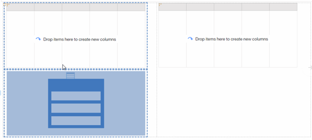
- When a second List object is placed to the right of the first List object, blue dotted line appears indicating a new table cell will be created to the right of the first List. A table with 1 row and 2 columns will be created as a result.

- When dragging a third List right below the first one but very close to the first List, guideline appears indicating the first cell will be split into two cells and the right-hand cell will span both cells. If we move the third List further below the first List, a new table will be created instead.
Although we are automatically creating tables for you, it’s still very easy to figure out the entire structure of the report or the object you are working with. Take advantage of this icon that displays all objects being created. The blue dotted line highlights object being selected.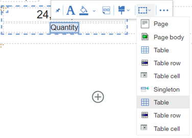
Report authors can also resize objects directly on canvas using one of its grippers.
Resizing directly on canvas allows 5% increments only and this is by design. More precise sizing options are still available under the Properties panel.
This feature can be disabled under Report Options.
Reusable styles
All styling functionalities are now consolidated into a single dialog that’s directly available from the OnDemand toolbar. Report authors can customize any object in one location and save the customized styles for reuse in other reports. All styles are saved with the user profile in content store database and can be preserved during deployment process.
For List, Crosstab and Table objects, the new style dialog even allows the report authors to style parts of the object such as table header, table cell, etc.
Although there is no explicit way to share a style between users, you can easily copy any styles from reports you have access to. To do so, simply open the report in edit mode and select the object with styles applied. The new style dialog will reflect all changes that’s currently made. You can give this style a name and click save to save it as your personal reusable style.
New navigation UI
Report authors can easily switch between report pages and report queries using the new navigation hierarchy. This is located at the top of the authoring interface. On demand Toolbar can also be fixed at the top of report canvas instead of floating with selected objects.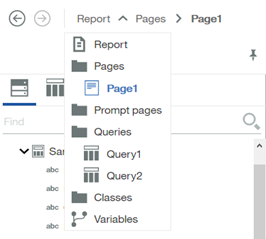
You can also customize what shows up in this view by right click the area beside the navigation hierarchy.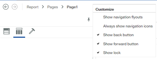
Let’s take a look at a specific query, Query 1. First, you can see the name of the query available from the navigation hierarchy. Many useful features such as run tabular data are also available in this view. Plus signs have been added to filters and data items sections making it must easier and faster to add new items.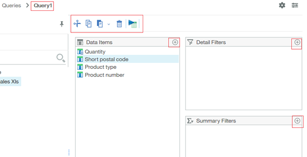
Useful report options have a new home now. You can access them from the gear icon.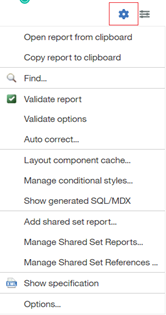
You can also right click at an empty area of the data items list and choose to ‘Display data items based on selection’. This will dynamically filter the data items list to reflect whatever object is being selected on the report page. A useful way to understand how queries and report objects are tied to each other.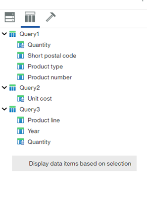
Smart Visualization recommendation
When data items are selected and dragged directly from the metadata tree onto the report canvas, Cognos Analytics will automatically render the best visualization to represent the data. Report authors have the option to choose an alternative visualization from the list if the default one is not preferred. This feature can also be turned off through report options.
11.1 interactive Visualizations
We are introducing a set of visualizations that are written in JavaScript. Some of the visualization types were already available in the product in a previous release, but some visualizations are brand new to Cognos Analytics. They are Bullet, Hierarchical packed bubble, Marimekko, Network and Treemap.
All 11.1 visualizations support the following new features:
- Custom palettes
- Animations
- Use percentage size so the visualizations resize based on screen resolution
- Client-side data storage
- Responsive
Client-side means browser side. Once a report has executed, we can store data used by visualizations in a local storage in JSON format. This local storage is temporarily cached in browser and will be deleted once the report is closed. Since the 11.1 visualizations are written in JavaScript, they can consume and interact with data stored in this local storage without the need to query against the database. This provides extraordinary performance gain when interacting with data on a visualization. This data storage is also available with saved report output.
Report authors can also include extra data as part of the visualization at authoring time. Extra data is available for report consumers to leverage when interacting with visualizations using the build in filter UI.
11.1 visualizations are responsive. This means they change dynamically to maintain the maximum amount of data based on the available screen size. For example, you may see us removing axis titles, padding, or change legend positions automatically when the report is displayed on different devices. Responsive option can be turned off by set property called ‘Optimize visualization size’ to No.
Here is an example. Same visualization when viewed on different screen sizes.

Custom palette
Cognos Analytics provides three types of palettes in 11.1.
System: These are out-of-the-box color palettes provided by Cognos.
Global: Administrators can define custom palettes and make them available for all users to use in a dashboard, a report or a story.
Custom: Users can define custom palettes when working on visualizations inside of a dashboard, a report or a story. Both categorical and continues palettes are supported on various visualizations. Custom palettes created can be saved and reused between all component. Saved palettes are stored in content store database and are available through deployment process.
Enhanced Mapping support
Report consumers can interact with different map layers to customize the display of a map.
Points can be grouped on a map to help report users to better analyze data at different zoom level. This is available as a property on both Points and Latitude and Longitude layer.
You can visualize data by location using a heatmap layer on a map. This is available as a property on both Points and Latitude and Longitude layer.
Copy and paste
Cognos users can quickly assemble a report by leveraging existing assets. Copy/paste is available from a dashboard, a story or a report to a report through keyboard commands. Data sources, queries, visualization types, and all common properties are copied over automatically.
When copying between reports, all queries and depended queries are also brought over automatically. This feature is available in all Cognos supported browser types.
#authoring#classicviewer#CognosAnalyticswithWatson#dashboard#explore#home#LearnCognosAnalytics#story