This release is by far our biggest one in terms of new Dashboard features. There’s lots to cover, I’ll start with the usability ones then dive into those that are more functional, providing some examples to better understand how they can help you explore and visualize your data.
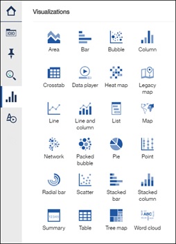
The first thing you’ll notice when you launch the dashboard is the new icons and colours. The new look provides a sharp, clean and professional canvas that now makes it easier than ever to get started and visualize your data.
Here are a few examples of the new icons:
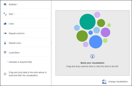
As well as the new look to the visualization expanded mode, here’s the bubble chart:
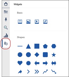
The section icons on the left of the dashboard have also changed a little. We have combined the Media, Text and Shapes widgets sections together to form a new section called Widgets panel. You’ll find all the same widgets within it.
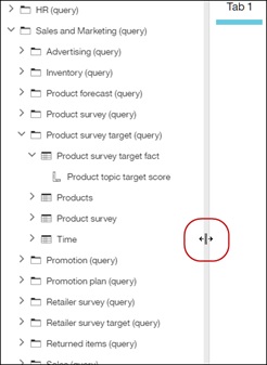
Another small but useful enhancement is the ability to stretch the sources panel. Meaning that you will no longer get truncated names if they don’t fit the panel default size. Just grab the edge and just make it wider, the field names will automatically adjust based on available space.
Bringing up the on-demand toolbar in charts
We have made some changes to the left and right-click actions to make the on-demand toolbar appear only when the user requests it.
· Left-click: Selects the data point
· Right-click: Invokes the On-Demand Toolbar (ODT)
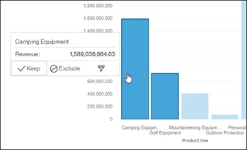
In the example below, I multi-selected two data points and right-clicked to bring up the ODT.
This will greatly reduce the number of instances where the on-demand toolbar was getting in the way by appearing when it wasn’t needed.
New visualizations slots
As soon as you expand a visualization to bring it into focus mode, you’ll notice that the data slots are now positioned on the left. This provides a much shorter drag and drop experience from the metadata tree to the slots. The mandatory ones are marked with a red asterisk, once those are filled in, a chart will render.

Multiple columns per slot
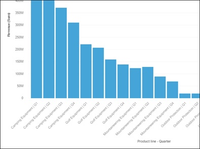
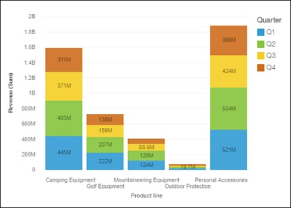
It’s often useful to break down the values of one column by another. To achieve this, we have added the ability to drag in multiple columns into the same slot. The result will show the values while taking the two columns into consideration. For example, we want to see a break-down of the revenue for our products broken by quarters. Drag Quarter under the Product Line field to create another row.
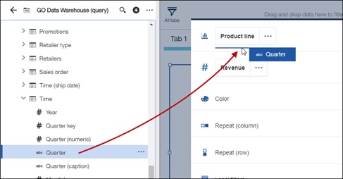
The chart will break-down Revenue by Product and Quarter
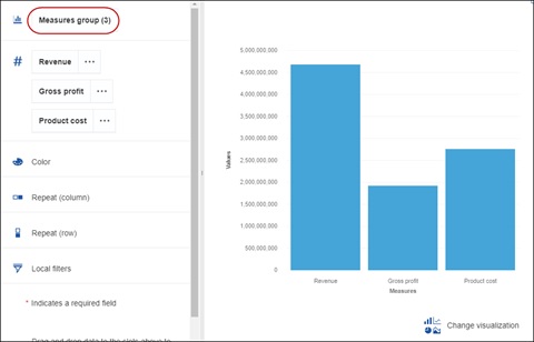
Measures as categories
The same paradigm can be applied to measures as well. We can now place multiple measures in the measure slot and in the process, create a Measure Group. This Measures group can then be moved to other slots, such as the colour slot, categories, or another. Meaning that now you could for example have a bar chart with each bar representing a measure.
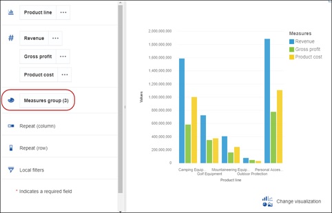
Drag the Measures group item to the Category slot to compare their respective totals
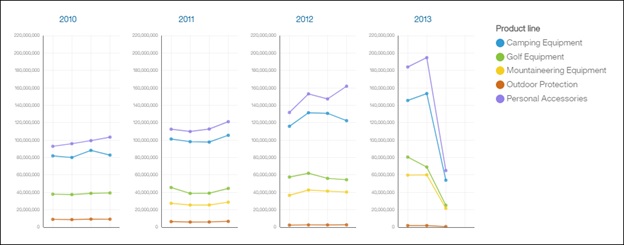
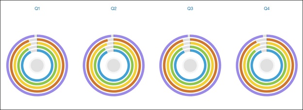
Repeat slots
We have added two new slots to the visualizations that allows us to repeat the visualization across the values of the column that is provided. This is handy when you want to declutter a chart and view the information side by side. For example, if we want to show the revenue of our products across years, we can drag the year into one of the Repeat slot and visualization will repeat itself for every year in the data.
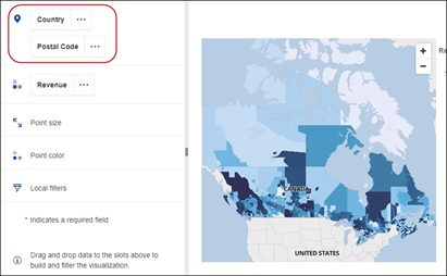
Mapping refinement slot
We introduced as part of 11.0.6 a new slot for refining the data for maps. This helped the system resolve ambiguous locations. In this release, the refinement slot is part of the location slot. Simply drag in the refinement column into the same slot as the items you wish to map.
Values labels in the charts
Sometimes it’s handy to be able to see the values of the data points without needing to touch the mouse to get the info via tooltips. We have added a property to show and hide values directly inside the chart. This is available for certain chart types, where we felt it was going to be particularly useful.
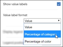
We can also switch it to show percentage based, which very handy to compare to other items.
New visualizations
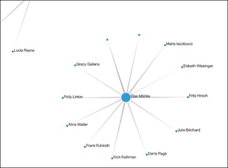
The Network visualization is handy when you want to see the connections between the values your data. Let’s pick some data that is hierarchical in nature such as Managers and Employees.
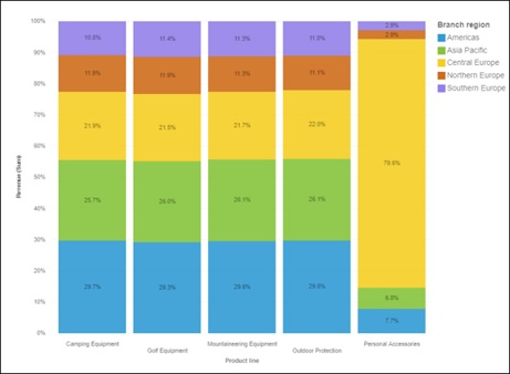
Stacked 100% bar chart
This type of viz is useful when you’d like to see how much each item is contributing to the total amount.
Radial bar
The Radial and Radial bar visualizations have been merged together into a single chart. To get a list of repeating Radial charts, place the value in the Repeat slot.
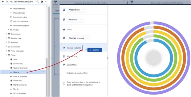
The Radial will then span across Quarters
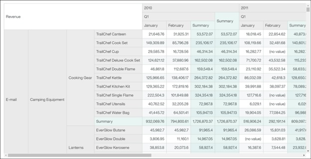
Crosstab
The crosstab continues to be an invaluable visualization to look at your data. In this release, we have increased the number of available nested levels to 10 on both edges. To maximize scrolling performance, we load into view only the number that are visible on the screen.
Visualization titles
To add a title to a visualization, we have removed the little pencil from the on-demand toolbar and placed a new property instead. We have also simplified its properties and removed the pre-defined styles, allowing the user to now create their own using the standard options of font, size and colours.
You’ll also notice that the titles now scale appropriately based on the available real-estate.
Proportional stretch the size of the widgets
A small change to call out is the ability to proportionally stretch the widget size. Rather than having a dedicated grabber location, we opted to use the well-used paradigm of holding down the shift key while dragging.
Renamed visualizations
To be more in line with industry standards, we decided to rename the Grid visualization is now called table.
The Hierarchy visualization is now called a List.
Filter enhancements
One of the changes that you’ll immediately notice when you launch the dashboard is the inclusion of a filter dock area at the top of the canvas. This area is used to drag in fields to be used as filters for either the current tab, or globally across all tabs. Simply drag in a field into one of the two sections and it becomes a filter.

This is particularly useful to free up the canvas and move widgets such as list widgets that were used as filters, up to the top.
The values shown in these filters are different than what is displayed in visualizations; the values are not affected by the user’s interactions. Meaning that even if the data doesn’t have a combination of values, the user can still select it in the filter widget. A point to note is that the measure filters in the dock are displayed as raw values, as opposed to local filters inside a viz which are post-aggregation.
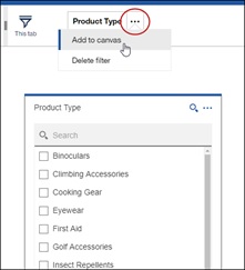
If you wish to add a filter to the canvas as opposed to have it as part of the dock, define a filter as a Tab filter and then click on the overflow menu and add it to the canvas.
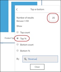
Continuing with filters, we have made some enhancements to the Top / Bottom feature. You will now be able to free-type the number of records you want to keep, or if you’d prefer to keep records based on a percentile, you can do that too. In the screenshot below, we are keeping the top 25% products based on revenue.
Calculation enhancements
Calculations play a large role in discovering key insights in your data. To make our calculations even more powerful, we have added three new abilities.
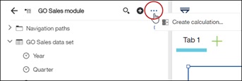
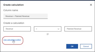
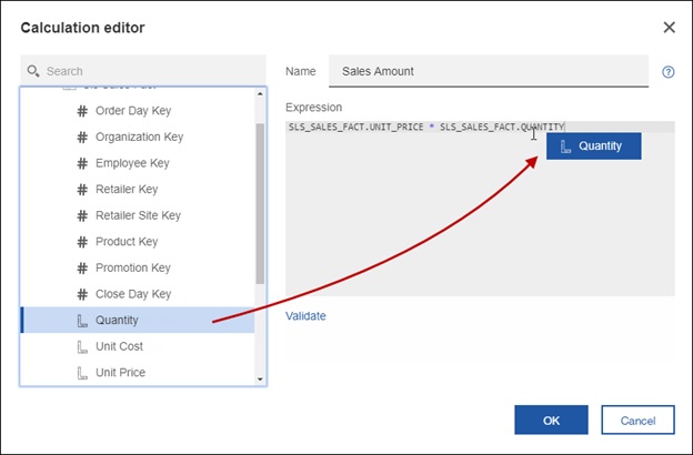
The first is the calculation editor where you will be able to free-type the expression you want. To get the editor to pop up, launch it from the top menu or from the handy link inside the Create calculation box.
Once the editor is up, you can type the expression of use the tree on the left to create your calculation. For help on the available functions, you can click on the little question mark “?” icon on the top right.
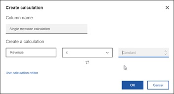
The second new calculation feature is the ability to quickly define a calculation with a constant. For example, if you only want to see 10% of a value, right-click on a single measure and create a calculation.
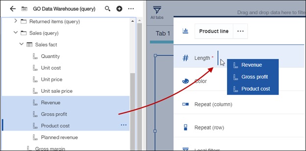
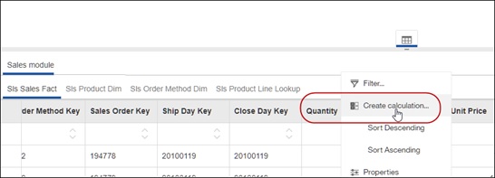
The final calculation enhancement is the ability to define an embedded calculation, also known as a local calculation. This is where the calculation takes place before the system aggregates the values. It is particularly handy when your calculation needs to evaluate the raw values as opposed to the summarized ones. This is done via the data tray at the bottom of the screen: first select the table, then open the data tray.
Navigation paths
To facilitate the use of navigation paths, you can now define your own directly from the dashboard, no longer requiring to open up a Data Module.
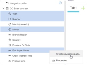
The simplest way to achieve this is to multi-select the fields you want to include and select Create navigation path from the context menu. In the screenshot below, I just created a data set and want to define a navigation path to help me better understand my data.
Once the navigation path is defined, it will appear at the top of the metadata tree, under folder.

Field defaults
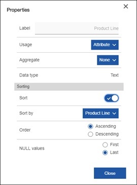
A dashboard author can set field property such as usage, aggregate and even sort. This is handy when there is a requirement for example to change a measure to always display the average by default. The end user can still change it if they’d like via the on-demand toolbar in a visualization.
This feature is not available on OLAP sources or Framework Manager packages.
Data tray
The last point to note is that we have removed access to the data tray at the bottom of the screen when the dashboard is in consumption mode. This was to clean up the interface and to better control what the end user sees when they do not have access to edit the dashboard.
Here is a short video that demonstrates these new features:
#11.0.7#CognosAnalytics#CognosAnalyticswithWatson#createBoard#dashboard#dashboarding#home#LearnCognosAnalytics#Release#Resources#What'snew?