Introduction
pandas is a fast, powerful, and flexible open source data analysis tool, which is built on top of the Python programming language. We will show how easy it is to use pandas in IBM Spectrum Conductor to run data analysis and visualization on cluster health information, and other data.
Key benefits:
- Quick to install and run.
- Flexible and customizable.
- Wide range of applications.
Part 1. Getting started
Installation can all be done by using the built-in tools in IBM Spectrum Conductor.
- Install the required packages using Anaconda management in IBM Spectrum Conductor:
- From the cluster management console, create an Anaconda or Miniconda distribution instance with a conda environment.
- Add the below packages to your conda environment using the default conda channel. For more information, see Managing packages within conda environments.
- Deploy an instance group and enable the built-in Jupyter notebook. Specify the Anaconda or Miniconda distribution instance. For more information, see Enabling notebooks for an instance group.
- Open Jupyter and create a new notebook with Python 3. For more information, see Open a notebook and create a note.
Part 2. Example: Aggregated cluster health information
The dashboard of the cluster management console displays cluster health information for the entire cluster.
- To generate the data, add and run the following code in a cell, where resource_group is the resource group that you want to analyze, and rest_url is REST API URL of your cluster. You can find the REST API URL by running the command: egosh client view REST_BASE_URL_1
import pandas as pd
import lxml, requests

# Define cluster information
resource_group = "ComputeHosts"
rest_url = "https://www.myhost.com:8543/platform/rest/"
EGO_TOP = "/opt/ibm/spectrumcomputing"
auth = ("Admin", "Admin")

headers = {"Accept":"application/json", "Content-Type":"application/json"}
verify = EGO_TOP + "/security/cacert.pem"

# Send request to get member hosts under the resource group
request_url = rest_url + "ego/v1/resourcegroups/" + resource_group + "/members"
resp_hosts = requests.get(request_url, auth=auth, headers=headers, verify=verify)

# Create dataframe in pandas to store the returned information
df_hosts = pd.DataFrame(resp_hosts.json())
df_hosts.set_index('hostname', inplace=True)

# Add new columns to dataframe for host status and CPU utilization
df_hosts['CPU Utilization'] = ""
df_hosts['Status'] = ""

# Fill in CPU and status data for each host in dataframe
for i, row in df_hosts.iterrows():

    # Send request to get host details
    request_url = rest_url + "/ego/v1/hosts/" + i
    resp_host_detail = requests.get(request_url, auth=auth, headers=headers, verify=verify)

    # Get CPU and host status data for the host
    attr = resp_host_detail.json()['attributes']
    ut = list(filter(lambda x:x["name"]=="ut",attr))[0]['value']
    status = list(filter(lambda x:x["name"]=="hostStatus",attr))[0]['value']

    # Fill in data to dataframe
    df_hosts.at[i, 'CPU Utilization'] = ut
    df_hosts.at[i, 'Status'] = status
- To view the data, add and run the following code in a cell:
df_hosts
- To analyze the data, add and run the following code in a cell:
# Filter only hosts in “OK” status and sort them by CPU utilization
df_hosts_ok = df_hosts[df_hosts['Status'] == 'ok'].sort_values('CPU Utilization')
# Convert CPU utilization to numerical format for plotting
df_hosts_ok['CPU Utilization'] = df_hosts_ok['CPU Utilization'].astype(float)
# Calculate slot utilization for each host and the data to a new column
df_hosts_ok['Slot Utilization'] = (df_hosts['numslots'] - df_hosts['freeslots']) / df_hosts['numslots']
- To visualize the data, add and run the following code in a cell:
# Plot host status summary for the resource group
df_hosts['Status'].value_counts().plot.pie()
# Plot bar graph for host CPU in the resource group
df_hosts_ok[['CPU Utilization']].plot.barh(figsize=(10,10),xlim=(0,1))
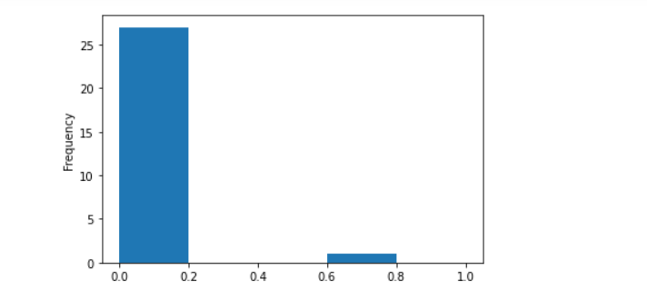
# Plot histogram for CPU utilization in the resource group
df_hosts_ok['CPU Utilization'].plot.hist(range=(0,1), bins=5)
A pie chart of host status information for the resource group is displayed:
 A bar chart of CPU usage for each host in the resource group in descending order is displayed.
 A histogram of CPU usage for hosts in the resource group is displayed:
- To customize the visualization to display slightly more details, add and run the following code in a cell:
# Plot bar graph for host CPU and slot utilization in the resource group
df_hosts_ok[['CPU Utilization','Slot Utilization']].plot.barh(figsize=(10,10),xlim=(0,1))
# Plot histogram for CPU utilization in the resource group, with number of bins expanded to 10
df_hosts_ok['CPU Utilization'].plot.hist(range=(0,1), bins=10)
A bar chart of CPU usage for each host in the resource group in descending order is displayed along with its slot utilization. You can see whether high CPU usage is correlated to high slot usage:
 A histogram of CPU usage for hosts in the resource group is displayed with more detailed breakdown:
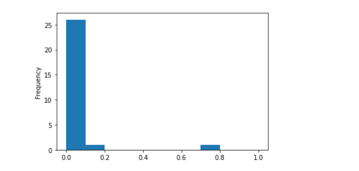
Part 3. More applications
Combining pandas with REST APIs in IBM Spectrum Conductor, you have many more applications for data analysis. To analyze daily applications failures, add and run the following code in a cell:
import pandas as pd
import lxml, requests
# Define cluster information
rest_url = "https://www.myhost.com:8643/platform/rest/"
EGO_TOP = "/opt/ibm/spectrumcomputing"
auth = ("Admin", "Admin")
headers = {"Accept":"application/json", "Content-Type":"application/json"}
verify = EGO_TOP + "/security/cacert.pem"
# Send request to get all applications submitted
request_url = rest_url + "conductor/v1/instances/applications"
resp = requests.get(request_url, auth=auth, headers=headers, verify=verify)
# Create dataframe in pandas to store the returned information
df = pd.DataFrame(resp.json())
# Convert UNIX time to date
df['endtime'] = pd.to_datetime(df['endtime'],unit='ms').dt.date
# Define filters for applications in failed and finished states
filt1 = df['state'] == 'FAILED'
filt2 = df['state'] == 'FINISHED'
# Count the number of applications in each state per day and store in dataframes
failed = df[filt1].endtime.value_counts().sort_index()
finished = df[filt2].endtime.value_counts().sort_index()
# Merage into single dataframe and label the columns
results = pd.concat([failed,finished],axis=1)
results.columns = ['Failed apps', 'Finished apps']
# Plot bar graphs
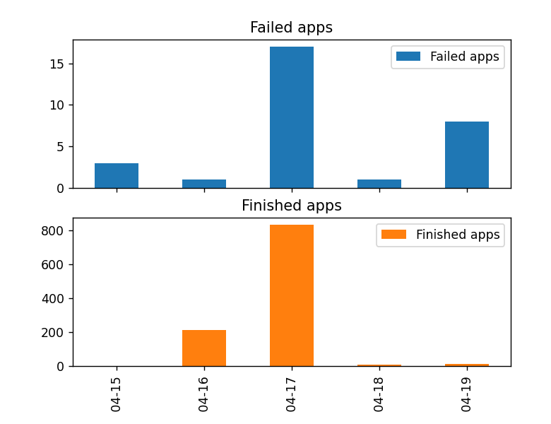
results.plot.bar(subplots=True)
Bar charts are displayed for number of failed applications for each day relative to the number of finished applications. Notice the high number of failed applications on both 04-17 (April 17) and 04-19 (April 19). However, the failure rate is much higher on 04-19 (April 19).
Give it a try and tell us what you think by downloading IBM Spectrum Conductor 2.5.0 on Passport Advantage or the evaluation version! We hope you are as excited as we are about this new release!
Log in to this community page to comment on this blog post. We look forward to hearing from you on the new features, and what you would like to see in future releases.
#SpectrumComputingGroup