This post provides a brief overview of some of the features in Cognos Analytics and how to get started. We'll start with some sample data, explore it, and then create a dashboard.
Cognos Analytics is available as a cloud or on-premise-based business intelligence and analytics solution. A solution that makes it easy to visualize, analyze, and share insights about your business.
Explore relationships and patterns with the help of unbiased data discovery. Receive more profound insights you can understand.

You can upload or connect your own data source. However, for the purpose of getting started quickly and easily, you can connect to our pre-loaded sample data source. From there you can start exploring create a dashboard.
Start with data
We're going to use data from a fictional telecommunications company to learn how to explore the factors that affect customer retention and create a dashboard.
The Telco customer churn sample data module tracks a fictional company's customer churn based on various factors. The churn column indicates whether the customer departed within the last month. Other columns include gender, dependents, and monthly charges. There are columns that contain information about the types of services each customer has.
To get started exploring your sample data, complete the following steps.
- From the Welcome page, browse to the Telco customer churn sample by clicking Team content > Samples > Data.
- Click the
 button and select Telco customer churn.
- Select Create exploration.
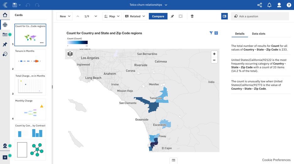
An exploration is created.
Explore the data
is a flexible workspace where you can discover and analyze data. Uncover hidden relationships, create advanced analytics visualizations, and identify patterns that turn your data into insights.
The following relationship diagram shows Total Revenue as the field of interest in the center. Nine related fields are connected to Total Revenue based on the strength of the relationships.
The thickness of the connecting lines indicates the strength of the relationship
- Interact with the relationship diagram by selecting a node that you might be interested in. Note that you can also multi-select nodes to get visualizations and explore insights based on multiple fields that you are interested in.
- Let's select the blue "Total Revenue" node in the middle of the diagram. A list of possible visualizations displayed as thumbnails. The list of called suggested starting points, updates to include the field you selected.
- Click the
 button on the Driver analysis visualization that shows "Total Revenue" to add it to your Cards pane and maintain the current view.
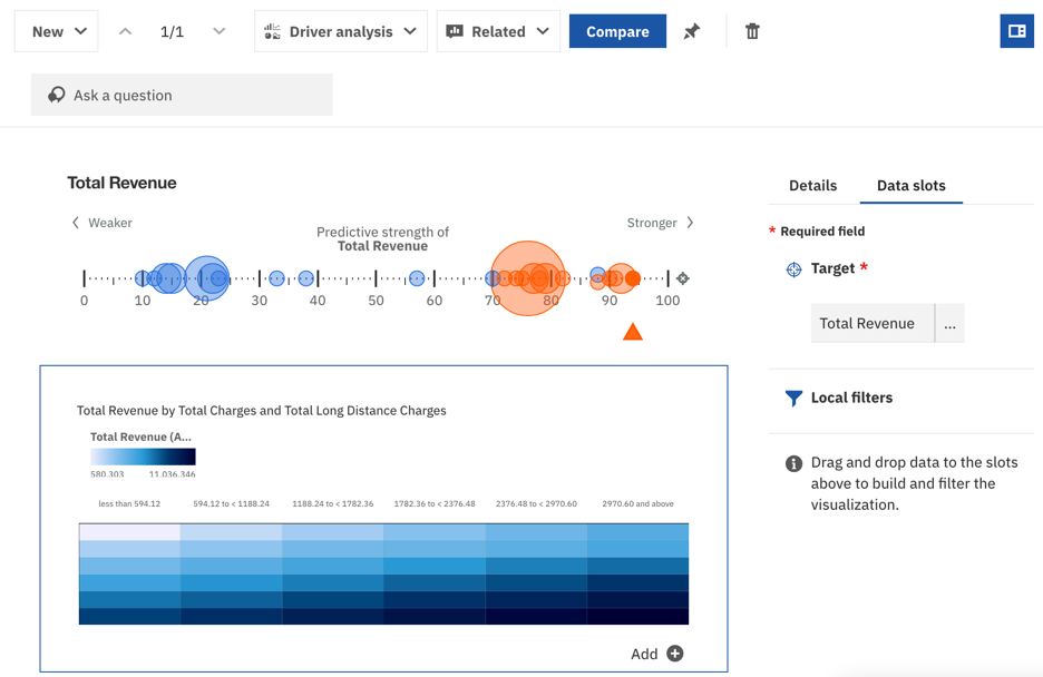
A Driver analysis visualization shows you key drivers, or predictors, for a target. The closer the driver is to the right, the stronger that driver is. The color indicates the number of factors or drivers that work together to influence the target. Blue indicates a single factor. The orange color means that there is a combination of two factors.
The size of a bubble indicates how many combinations of factors exist at a given strength. The small bubbles indicate only one factor. If the bubble is blue, a larger bubble would mean that there is more than one factor that acts alone to influence the target at that level of strength. Likewise, a larger orange bubble means that there are multiple combinations of two factors that drive the target at the same level of strength.
- Click the Explorations
 button if the Cards panel is not already open, and select the Total Revenue card to view it.
- Click the
 button on the visualization that shows "Total Revenue by Total Charges and Total Long Distance Charges" to add it to your Cards.
- From the Cards panel, select your new card showing "Total Revenue by Total Charges and Total Long Distance Charges" to open the visualization.
- View and analyze the generated text under the Details tab.
Create a dashboard
With a Cognos Analytics dashboard, you can build sophisticated visualizations of your analytics results and communicate the insights you've discovered in your data on the dashboard. Then, share the dashboard with others.
You can create a dashboard from scratch. However, in we'll use the conversational Assistant to automatically generate a dashboard.
- Click the
 button to open the assistant panel view.
- Type
create dashboard. A new dashboard is generated based on the currently selected data source. In this example, the data source would be the Telco customer churn sample.
- Modify the visualizations, tabs, order, and so on. By default, the generated dashboard includes advanced analytics. The three tabs are based on the three most interesting fields in the data as determined by our AI.
- Save your new dashboard in the Team Content folder. Now your colleagues with access to the Team Content folder can view and interact with your dashboard.
Now you see how easy it is to use Cognos Analytics to start exploring relationships in your data and quickly get up and running with a compelling dashboard that communicates your insights!
More Cognos Analytics components
For more information on Cognos Analytics, see Getting started in Cognos Analytics.
For more detailed information on the Telco customer churn sample, see the Telco Customer Churn (11.1.3) blog post.
For more Cognos Analytics demos and tutorials, see https://www.ibm.com/demos/collection/IBM-Cognos-Analytics/.
#authoring#classicviewer#CognosAnalyticswithWatson#createBoard#createstory#dashboard#explore#home#LearnCognosAnalytics#story