A clean user interface that provides access to the most useful information is a critical part of the user experience for TBM applications. In this story, Bill explains how his TBMO eased user access to custom reports in Apptio.
***
Rebecca Walker—manager of the TBM Office, and hence, Bill's boss—walked into his office and asked:
"Hey, Bill. I see we can now get to your latest FinOps report from the Apptio landing page. How did you go about that?"
"It was important that our users would see things they could easily relate to. We first made a copy of the original landing page—the Service Costing report:"
"And then?"
"We redirected the system to use this new landing page and started customizing the buttons to display something more relevant to our users."
"Do you know who they are, Bill?"
"We sure do. Whenever we create the credentials, we assign each of them to a Persona, mostly based on their organizational path. 35% belong to the business units, 27% are application developers, 13% are SREs—Service Reliability Engineers—7% are from Finance and 5% are IT Product Managers. The rest are from other transversal functions (Enterprise Architecture, Security, etc.)"
"Do they have a strong financial background?"
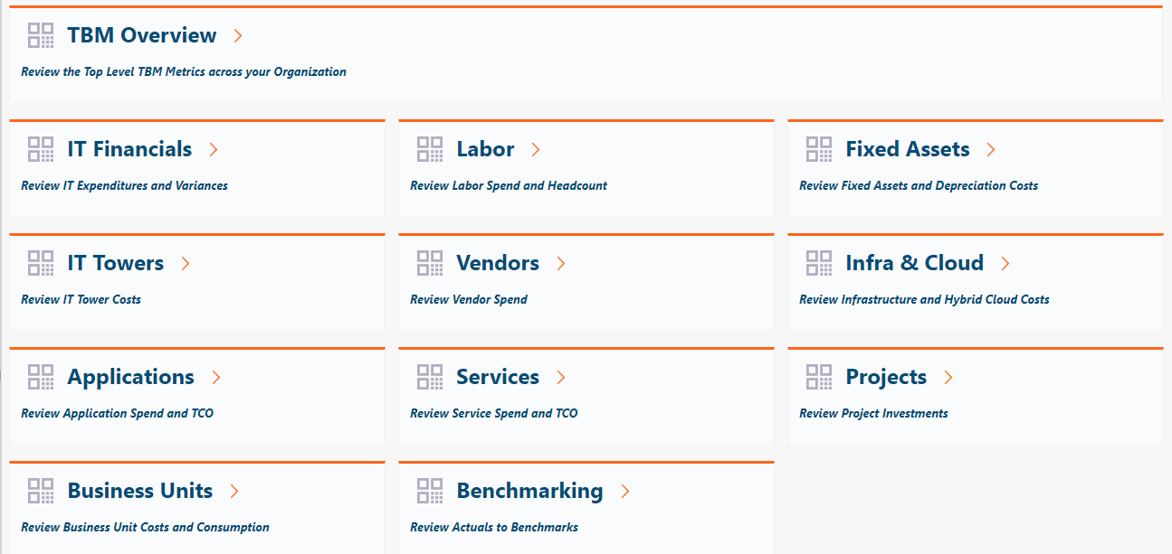
"Hardly. Only the Finance people have. The rest have little or no exposure to financial numbers and, frankly, they weren't interested at first. This made it extremely important to present them with a menu of choices that would make sense to them. This is our current landing page:"

"What is the frame on the left?"
"The list of Report Collections. As you can see, we have created plenty of new ones, prefixed by our company name."
"And what are the other ones?"
"Out-of-the-box (OOTB) collections provided by Apptio. We have been toying with the idea of hiding them altogether, but we haven't done it yet. We get the occasional user that access one of the OOTB reports, possibly out of idle curiosity, I guess. TBM tire-kickers, if you will." Bill smiled.
"Right, you cloned the landing page and then, what?"
"We took the buttons one by one and replaced the definitions and the labels with pointers to our custom reports. Since you asked about the FinOps report, I'll show you how we did it:
1) Right-clicked on the button and selected Properties:

2) In the Button section, we changed the labels to display what you now see on the screen:

"I'm not sure I understand the whole HTML code, but we kept it untouched, except for the text parts we needed to change, namely the button name and the description underneath."
3) In the Action section, we changed the report path to the one we needed:"
 "And that was that?"
"Yes. Only that we had to do it for every button on the original page. Sometimes it got a bit tricky, as the Navigate part is slightly different for model reports, for example. See this one:"
 "In these cases, we had to tinker with the system a bit, until we got it right. Now it's just a matter of copy-and-paste."
"Also," Bill continued, "we organized the report collections so that they would contain related reports, and there wouldn't be too many."
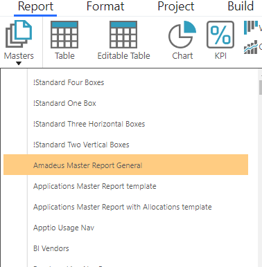
"How do you make all reports look similar?"
"We use a Master Report", a template if you like:"
"Thus, every report gets the same header, with Apptio's and our corporate logo."

"We added a few buttons that allows user to contact us via email. In this case, it's an HTML component with a mailto: keyword:"

"They can also access to our library of resources and support materials. This is another HTML component:"

"Last, but not least, we copied the home button from the OOTB reports, so that users can easily go back to the landing page."
"Thank you, Bill. Most informative."
"My pleasure, Rebecca."
***
c) Guillermo Cuadrado, 2022
#BillTheTBMGuy#TBMStudio