How to create a Bubble Chart
Bubble charts are useful to help us represent 3 different values in single chart. We have X and Y axis but also the size of the Bubble can represent additional values. Unfortunately Apptio does not have a bubble chart capability out of the box.
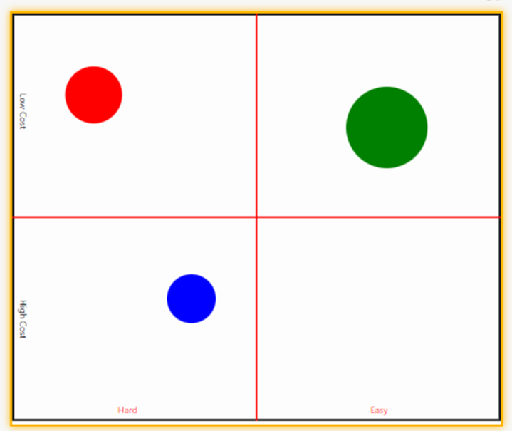
For example the chart below could represent the projects. We have difficulty as the X axis, the cost of the project as the Y axis and the size of the bubble as the savings allowing us to visualise and pick the projects with the return on investment.
Ideally we don’t want to have a fixed number of bubbles since that would involve modifying the HTML each time we added a project. Unfortunately Apptio does not support Java script in the HTML component so we need to look for other ways to take data out of a data set.
Luckily enough Apptio has a function to do this: Uniquevalues(dataset:column)
This takes all the unique values in a dataset for the selected column and puts it in to a single row.
For simplicity we are going to create a data set with the values we want to chart
Example Data
For this example we need to use Excel to create a table with the following values in it
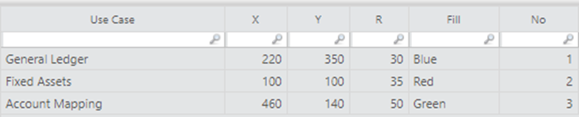
Create a table in Apptio with the name Bubble Chart
Upload this the data from the Excel Table you have created in to Apptio
Creating the Logic
Create a Formula step with the following formulas
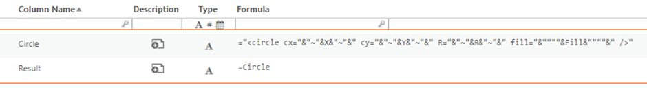
The number of “ in the Circle formula is vital as this is the command in HTML to draw the circle
="<circle cx="&"~"&X&"~"&" cy="&"~"&Y&"~"&" R="&"~"&R&"~"&" fill="&""""&Fill&""""&" />"
* You should be able to paste the above in as it is not subject to formatting. If this does not work then check the quotes are not being changed to a different character
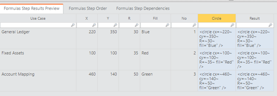
If this has worked you should end up with the following table
Creating the second table to drive the chart
Now we need create a second table in Excel with the following data. This will be the data that brings together all the values from the data table we have just created.
Create a second table in Excel with the following data
Upload this in to a table called Bubble Chart 2
Extracting the values from the original data table
Now create a formula step with the following
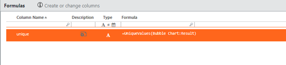
This will create a column with all of the unique values from all of the rows from the dataset Bubble Chart for the column Result in the column you have created surrounded by “” separated with a comma
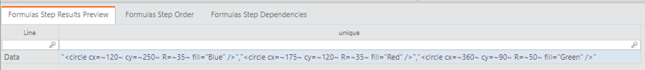
You should now have a row in the table that looks like this
Now add a grouping step to separate the next formula step
Add the formula step and add the following columns
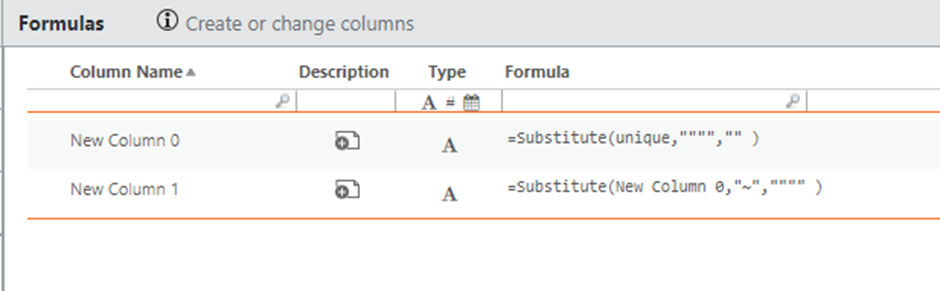
The above columns use the substitute command to re-format the Unique column to remove the superfluous quotes at the start and end of the column and change the ~ to a single quote. This changes the line to be the correct format for the HTML to draw each row’s circle from the original dataset in a single line.
Now Add a Model Step so that we can access this data in the HTML component
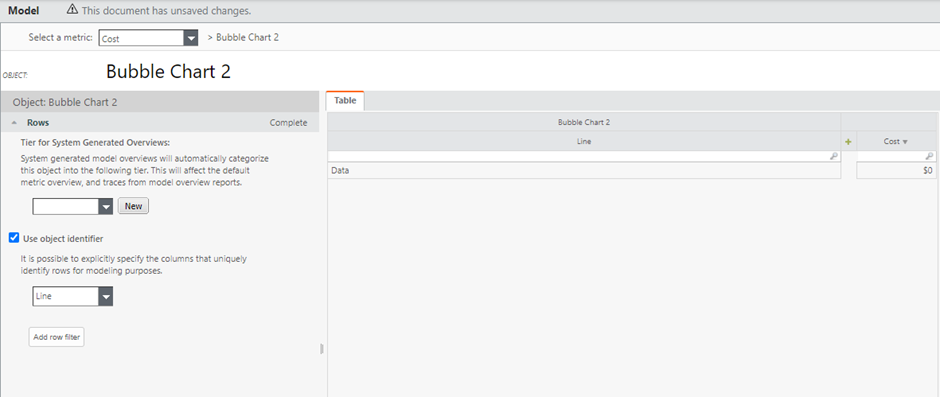
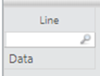
Select the Line column for the Object Identifier
When selecting Object identifiers it’s a good practice to have data that stays the same across months if possible so we will use the line column as this stays the same.
Creating the report
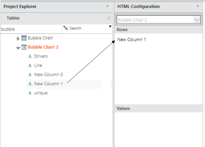
Now create a New report and add a HTML component on the report.
In the HTML Configuration drag the New Column 1 column from the Project Explorer into the Rows section as below
Select HTML and click the Edit Content button
In the HTML add the following
<svg viewBox="0 0 600 500" xmlns="http://www.w3.org/2000/svg">
<rect x="0" y="0" width="600" height="500"
style="fill:white;stroke:black;stroke-width:5;fill-opacity:0.1;stroke-opacity:0.9" />
<line x1="300" y1="0" x2="300" y2="500" style="stroke:rgb(255,0,0);stroke-width:2" />
<line x1="0" y1="250" x2="600" y2="250" style="stroke:rgb(255,0,0);stroke-width:2" />
<text x="130" y="490" fill="red">Hard</text>
<text x="440" y="490" fill="red">Easy</text>
<text text-anchor="middle" transform="translate(10,120) rotate(90)">Low Cost</text>
<text text-anchor="middle" transform="translate(10,375) rotate(90)">High Cost</text>
<%=Bubble Chart 2.New Column 1%>
</svg>
You should now have a page that looks like this
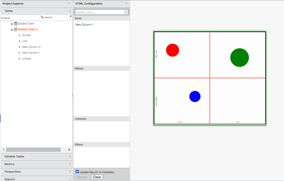
The HTML Box is scaleable and will resize the chart when you resize the HTML component so it can be as large or small as you like.
This will create bubbles for each unique row you have in your original data table. As the data varies over time the bubbles will change is position, size and shape to match the data you have entered.
#CostingStandard(CT-Foundation)