Any plans to add Conditional Formatting/Styles to Chart Visualizations ( e.g. a functionality to use a Data Item value as a color)?
Original Message:
Sent: Mon May 26, 2025 12:27 PM
From: Shaveta Srivastava
Subject: Assign colors to measures/series on Cognos charts
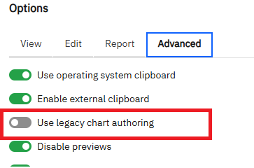
PGSDK is the legacy visualization engine and does not appear in the report's visualization dropdown unless it is enabled through the advanced feature that Marc highlighted above.
------------------------------
Shaveta Srivastava
Original Message:
Sent: Fri May 23, 2025 02:32 AM
From: Marc Reed
Subject: Assign colors to measures/series on Cognos charts
I believe that it is the much older Cognos 8 charts that are going. In 12.1 the following chart engines are available.

What isn't available is this:
Which would switch the charts options to Cognos 8 charts.
------------------------------
Marc Reed
Reporting Lead
Original Message:
Sent: Thu May 22, 2025 11:20 AM
From: Tomáš Polakovič
Subject: Assign colors to measures/series on Cognos charts
OK - I voted for the idea ;)
One more thing - I saw in the 12.1 deprecation list:
As of release 12.1.0, Presentation Graphics SDK (PGSDK) visualizations will not be supported and will be removed from reports.
I am not quite sure which visualizations this refers to (there are so many ;)) - I hope it's not the charts we discuss in this thread - do you know?
Thanks
------------------------------
Tomáš Polakovič
Original Message:
Sent: Thu May 22, 2025 09:58 AM
From: Marc Reed
Subject: Assign colors to measures/series on Cognos charts
If you're going to the effort to make sure all the categories always appear in the data then there isn't any need for the conditional palette - you can just use the normal palette.
For example, you know your data will always have the three product lines of Camping, Golf, Outdoor. You can just define a three colour palette.
I submitted an enhancement request about defining palettes to provide colour consistency across all Cognos products. Please vote on it! https://ibm-data-and-ai.ideas.ibm.com/ideas/CA-I-4538
------------------------------
Marc Reed
Reporting Lead
Original Message:
Sent: Thu May 22, 2025 09:26 AM
From: Andrei Istomine
Subject: Assign colors to measures/series on Cognos charts
Yes, this is still a bummer.
There were talks for quite some time about functionality to use a Data Item value as a color in a Viz... No ETA.
For now, I just add Dummy Data to make sure that ALL Color categories always exist in the Query regardless of the applied Filters.
And define a Custom palette to map required colors to categories.
In the attached picture there are 3 charts side by side. Only one has Legend visible because it is the same for all charts.
The Legend always has all Color categories even if there is no data for some due to Filters.
------------------------------
Andrei Istomine
Open to work - anything Cognos
https://www.linkedin.com/in/andreii/
Original Message:
Sent: Thu May 15, 2025 09:06 AM
From: Tomáš Polakovič
Subject: Assign colors to measures/series on Cognos charts
Hi,
is there a way of making sure that a specific measure/data point would always have the same color in Cognos Analytics charts?
We can define a palette, but if some data points will be missing due to filtering/prompting, the colors will shift.
What are best practice approaches to this?
Still on 11.1.7. If there is some development in this area in newer versions, that would be good to know as well.
Thanks
Tomas
------------------------------
Tomáš Polakovič
------------------------------