Dashboards are typically used in two ways: the first being for more traditional purposes, where a user creates a few visualizations and saves it to monitor their business on a daily basis. The second is much more dynamic, where the user selects a few fields, explores the data, changes it to different visualizations, filters the data to eventually find the answer they are looking for. In 11.0.3, we have added several enhancements that fit these two scenarios. Let’s take a look:
For the data exploration:
1) Calculations
When an end user looks at data, they often need to manipulate the data itself to show it in different ways and act on it. We have added the ability to create calculations directly in the dashboard to facilitate the discovery of insights or to simply show a value that normally would need to be done outside the tool.
To do this, select two columns, click on the new calculation button and then choose from the drop down menu of available calculations.
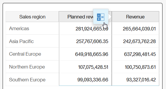

The new calculation appears in your visualization:

Once you have defined a calculation, it appears in the source panel on the left, ready for you to use it again in another visualization as needed.
2) Hover-over tool tip
It’s a simple gesture to quickly see the value of a particular data point without affecting the visualization. Hover your mouse over to the data point and a little pop-up tool tip appears with its context. To interact with the data point, click on it and more options will appear. For touch screens on iPads, a single tap will now bring up the tooltip.

For the users who build dashboards for monitoring purposes:
1) Relink a dashboard to another source
Once a dashboard has been created, it’s handy to be able to repoint it to a new source and keep going. For example, you’ve created a great dashboard based on your data, but now you’d like to repoint that same dashboard to a new source that contains more info that may or may not have the same field names. No problem, relink it and fix up the fields that don’t match.

Once you have relinked your dashboard, it will indicate which visualizations need to be fixed up. Here, in the screenshot below, you have relinked to another source which resulted in one of the four visualizations to be broken.

Simply expose the problematic data slots and fix them up from there. All the broken data slots are marked in red with the words “Missing:”.

2) Change the formatting of your fields
The dashboard will always take the default formatting based on what was defined in the source. However, as a user, sometimes it’s handy to have more control over how the numbers get displayed. We now allow the user to select the number of decimal points or even to abbreviate the number completely.


#Cognos Analytics
#Expert Post
#dashboards
#General Information
#releases
#11.0.3
#CognosAnalyticswithWatson#createBoard#dashboard#home#LearnCognosAnalytics