Data Distributions
Let’s start with data distributions, which will give us an overview of all the possible values, as well as how often they occur. In visual terms, that means drawing a histogram of the thermostat rebates. For simplicity, we can use a uniform sample of 1k rows taken from a larger data set.
The Data Refinery tool in Watson Studio lets you draw histograms of your columns easily, as well as many other charts that may involve more than one column at a time (scatter plots, time series, to mention a couple).
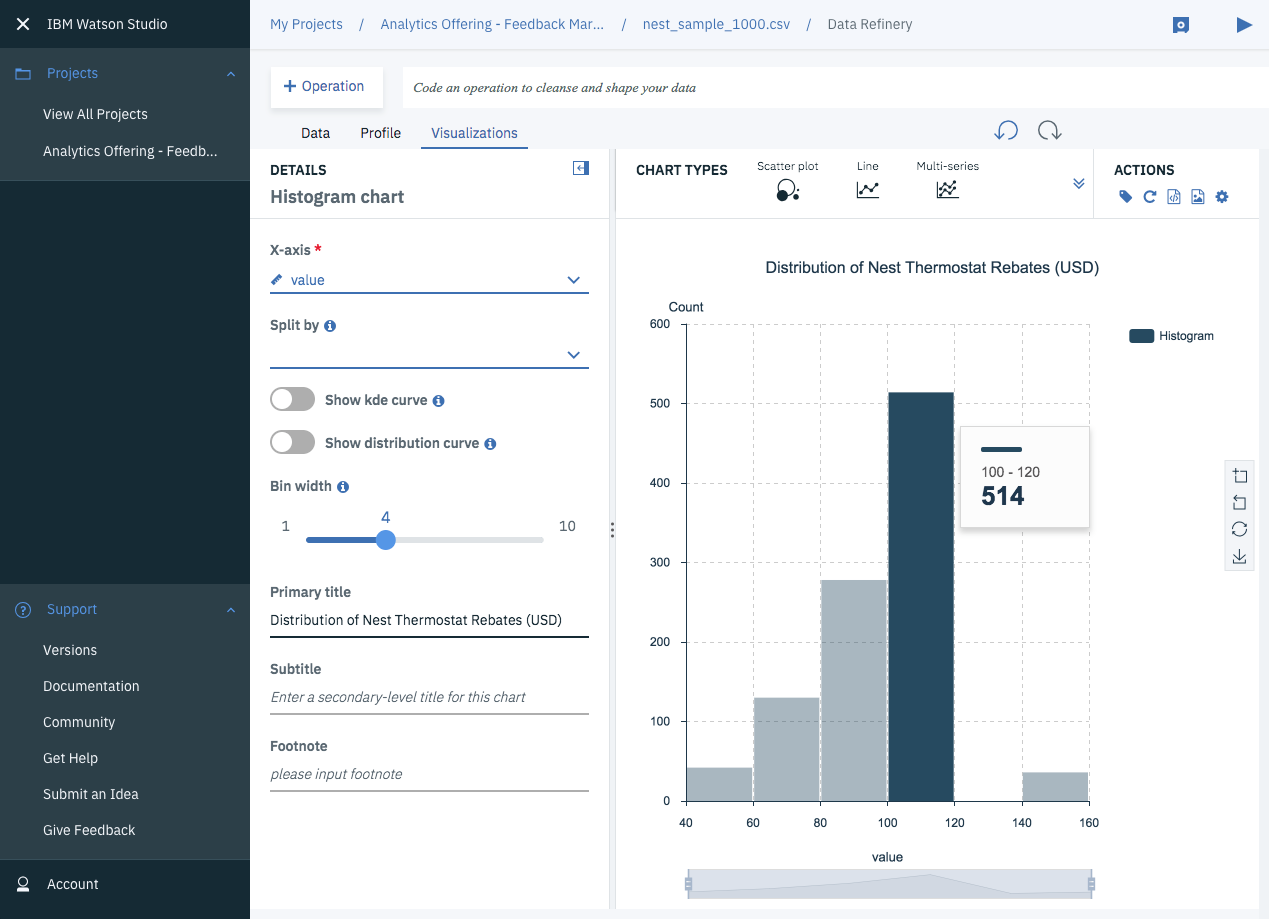 Distribution of Nest Thermostats Rebates (USD)
Note that just over half of the thermostat rebates come in between $100 and $120. I noticed that only a handful of zip codes have rebates over $140 or under $60, which piqued my interest. I decided to plot the regions receiving the lowest and the highest rebates on a single map. Thankfully, the data already included longitude and latitude information, so once I assigned a color spectrum from lowest (blue) to highest (red), I could lay the data onto a map of the States:
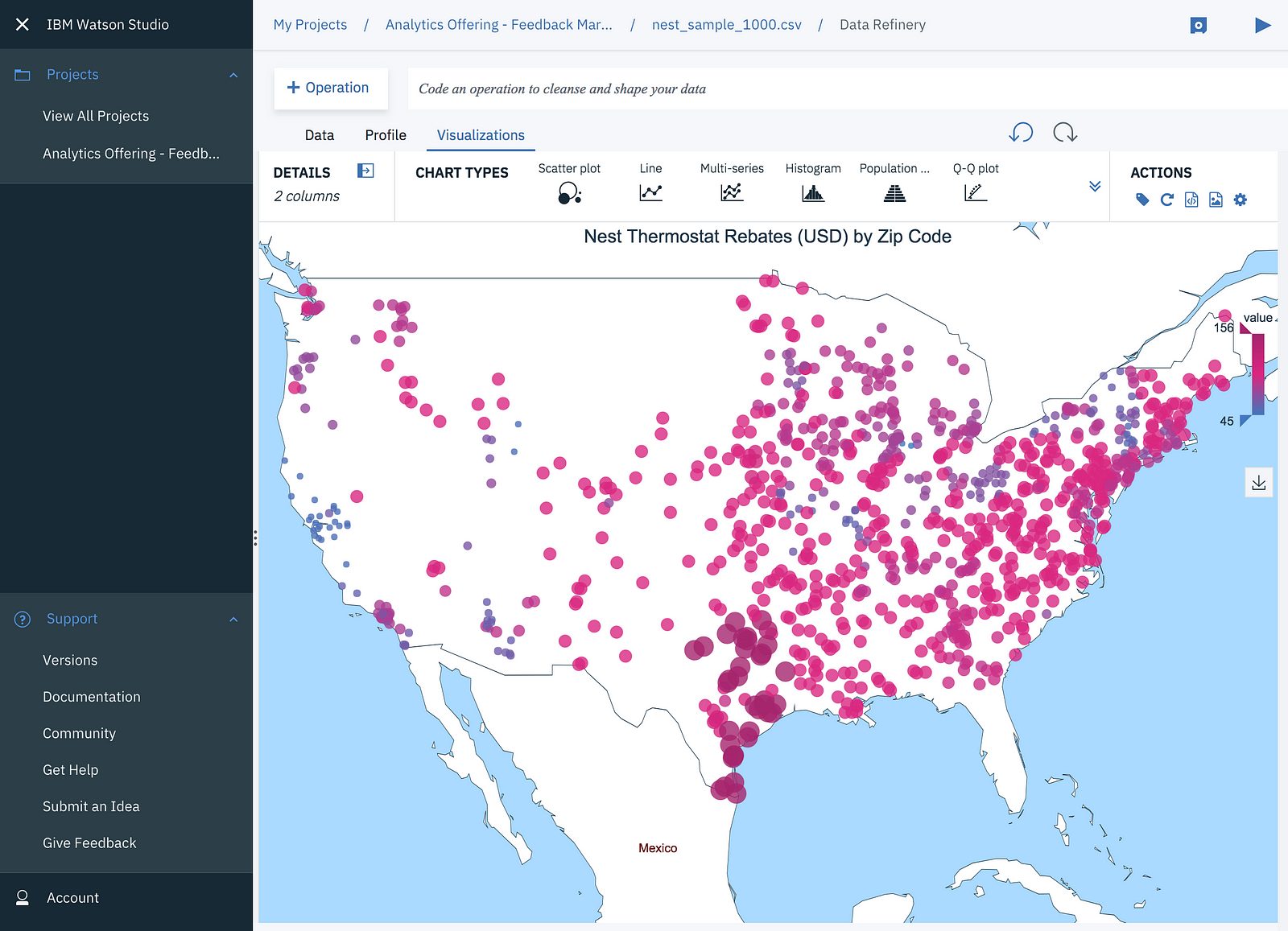
I noticed that North California’s rebates were lower than most of the other regions in the US. I also noticed that most of the largest rebates were in Texas. Honestly, I’m still not sure why that is. If you have guesses, certainly let me know.
The Data Refinery tool in Watson Studio have maps that you can use to lay down longitude/latitude data, and it let you configure the color spectrum easily with any of the columns of your data set.
Correlations with Demographic Features
To take a deeper look at the thermostat rebate distributions, I did a join by zip code to bring in additional demographic features like median and mean household income, as well as population size. None of these zip code demographic characteristics appeared to correlate in a linear way with the Nest rebates. The only strong correlation is between mean and median household income, which is not surprising.
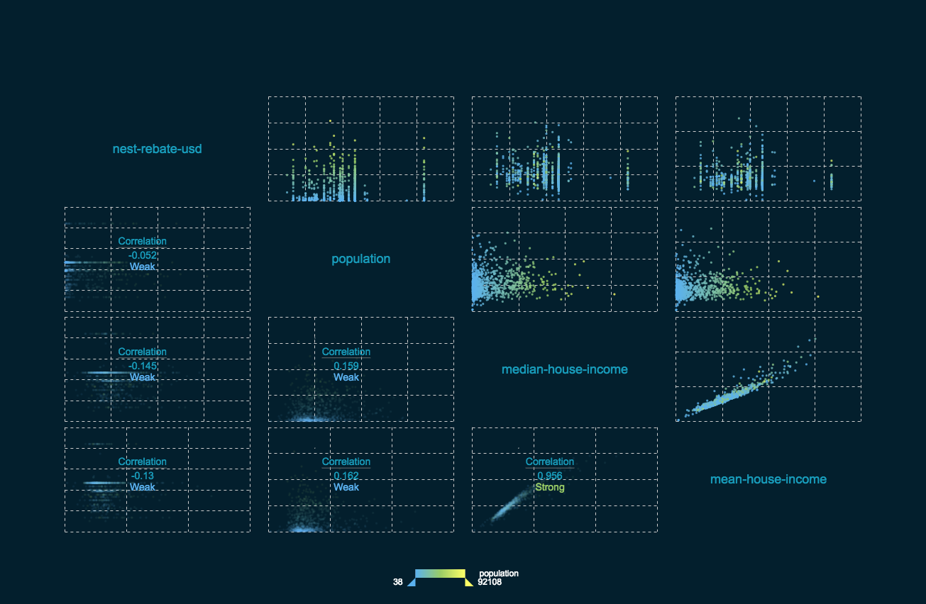 Correlation Plots Created with Data Refinery.
More Charts to Explore
Besides histograms and maps, the Data Refinery tool in Watson Studio offers a wide selection of visualizations, including t-SNE for visualizing high dimensional data:
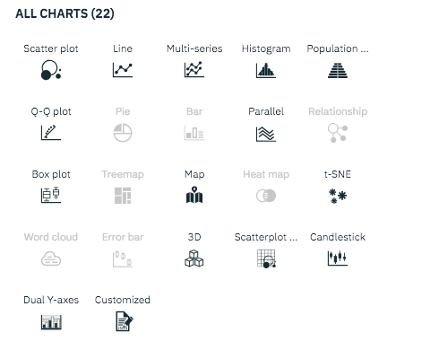 Chart Options in Data Refinery (part of Watson Studio)
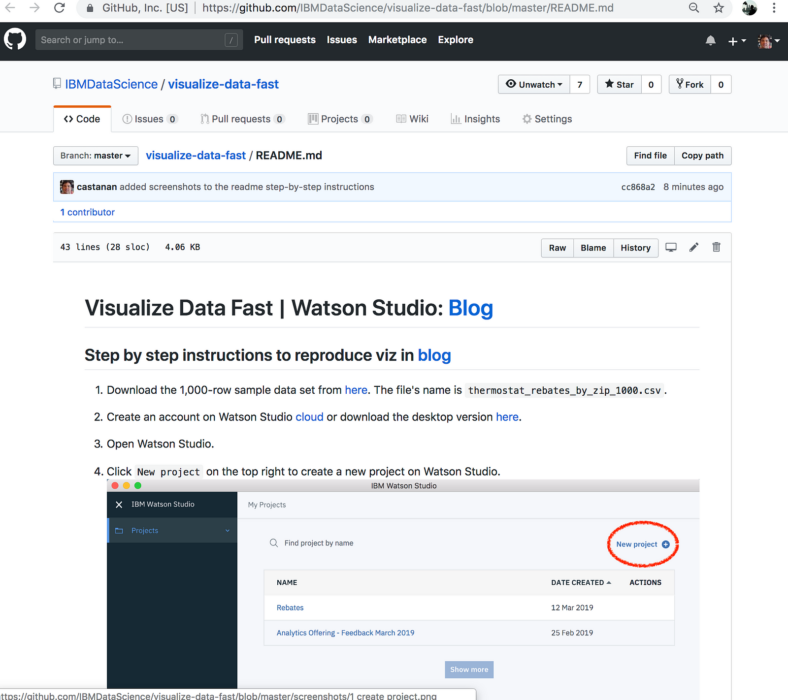
Step by step instructions on this github repo.
Jorge Castañón, Ph.D.
Senior Data Scientist @ Machine Learning Hub
--