Hi Christine,
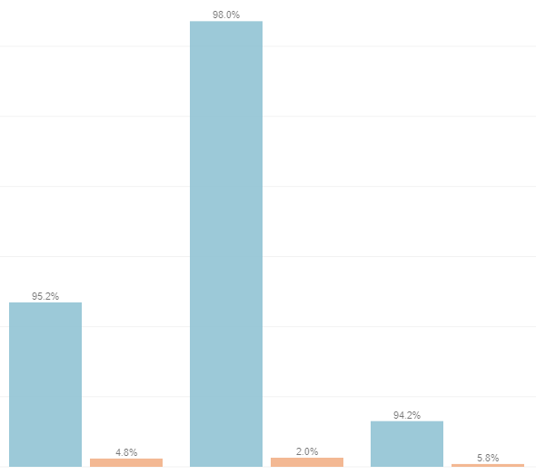
why do you think the bar heights are inaccurate? The option for the bar chart is just an additional label. It doesn't change the base value hence. I would say that's one of the advantages here: see the absolute value as bare height but the label shows the percentage of category/colour.
If you want to have your bar heights like the percentage, you need to have a corresponding measure (column) that contains these values or you create a calculation in your dashboard that computes the percent value. Then use it instead of the bases measure.
------------------------------
Robert Dostal
Team Leader BI
GEMÜ
Ingelfingen
------------------------------
Original Message:
Sent: Tue July 13, 2021 02:51 PM
From: Christine Alexander
Subject: Dashboard column chart - rescale bars after showing value as %
Good afternoon,
Does anyone know of a way to rescale the bars of a column chart on a dashboard after choosing to show value labels as a percentage?
The percentages will make more sense to the end user, but the inaccurate bar heights will throw them off.
Thank you for any wisdom you can share! Chris Alexander
#CognosAnalyticswithWatson