Business Automation Insights (BAI)

 View Only
  • 1.  Line Chart in BPC

    Posted Tue September 21, 2021 03:21 PM
    Greetings,

    I need to create a dashboard in BPC like the below screen shot :


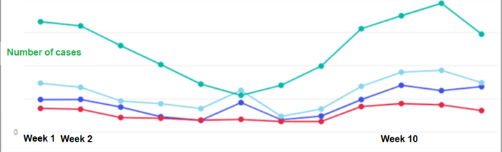
    These 4 different color lines are representing 4 different users who are working on different cases. Is it possible to have this kind of visualization in BPC ?

    I created a line chart which shows total number of cases in the system via a single line but now I want to plot cases per users(4 users) in the same line chart via 4 different lines

    Thanks

    ------------------------------
    Lakshya Agarwal
    ------------------------------


  • 2.  RE: Line Chart in BPC

    IBM TechXchange Speaker
    Posted Wed September 22, 2021 04:22 AM
    Hi - try using a "Period KPI" chart and adding the field containing the user information as a "Group by" parameter.

    ------------------------------
    Mark Ketteman
    Digital Business Solutions Engineer
    IBM United Kingdom Limited
    London
    ------------------------------